Design Problem Hypothesis
Stakeholder interviews revealed that Small Business Owners signed up for Autobooks hoping that it would help them simplify their process for sending invoices and getting paid, and that new users who sent an invoice within 30 days of signing up were much more likely to continue using Autobooks. The problem was that only around 23% of new signups were actually sending that critical first invoice.
“The problem was that only around 23% of new signups were actually sending that critical first invoice”
Watching videos of new users sessions made it clear that most new users didn't know where to start when they first landed on the Autobooks dashboard; many of them randomly clicked through different areas of the app, and others left the dashboard immediately after signing up. Our hypothesis was that by creating a clear path for new users to send their first invoice, we could double the number of users who sent an invoice within 30 days of signup, thus boosting retention and payment processing volume.
Role
I was the sole Product Designer on this project. The other team members I worked alongside were:
SVP Product, Product Managers
Conversion Copywriter
Engineering Team
QA Team
Impact
Users were guided through a step-by-step version of the invoice creation process, and were reassured about what their customers would experience upon receiving an invoice. Within a year, the percentage of users who sent who sent at least invoice jumped from 37% to 66%. User who sent a first invoice got paid at an astounding rate of 55%
“User who sent a first invoice got paid at an astounding rate of 55%”
Solution
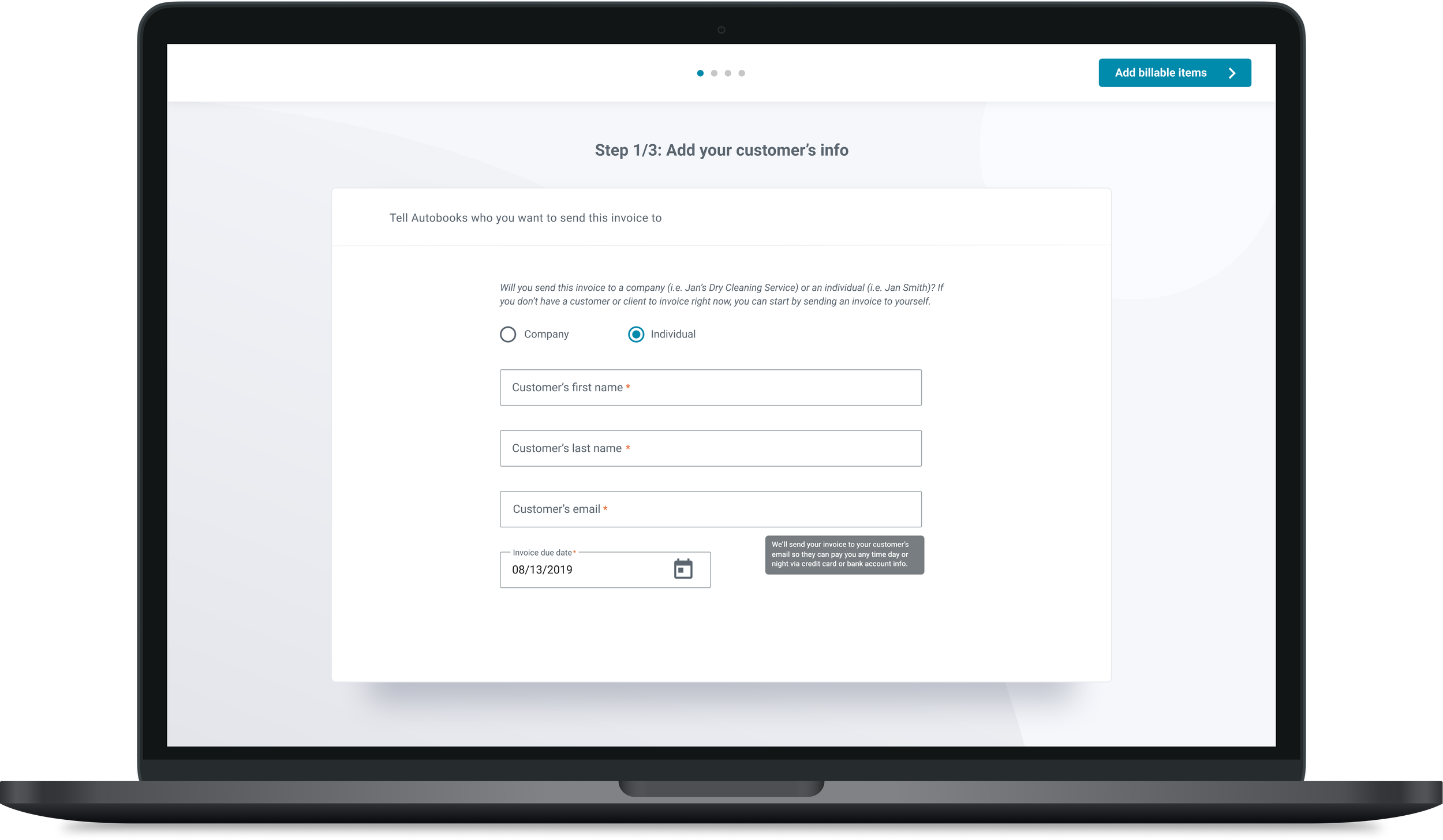
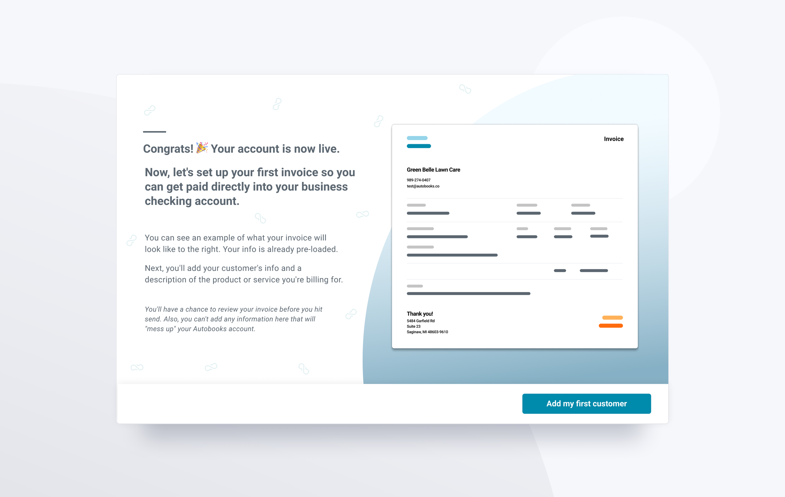
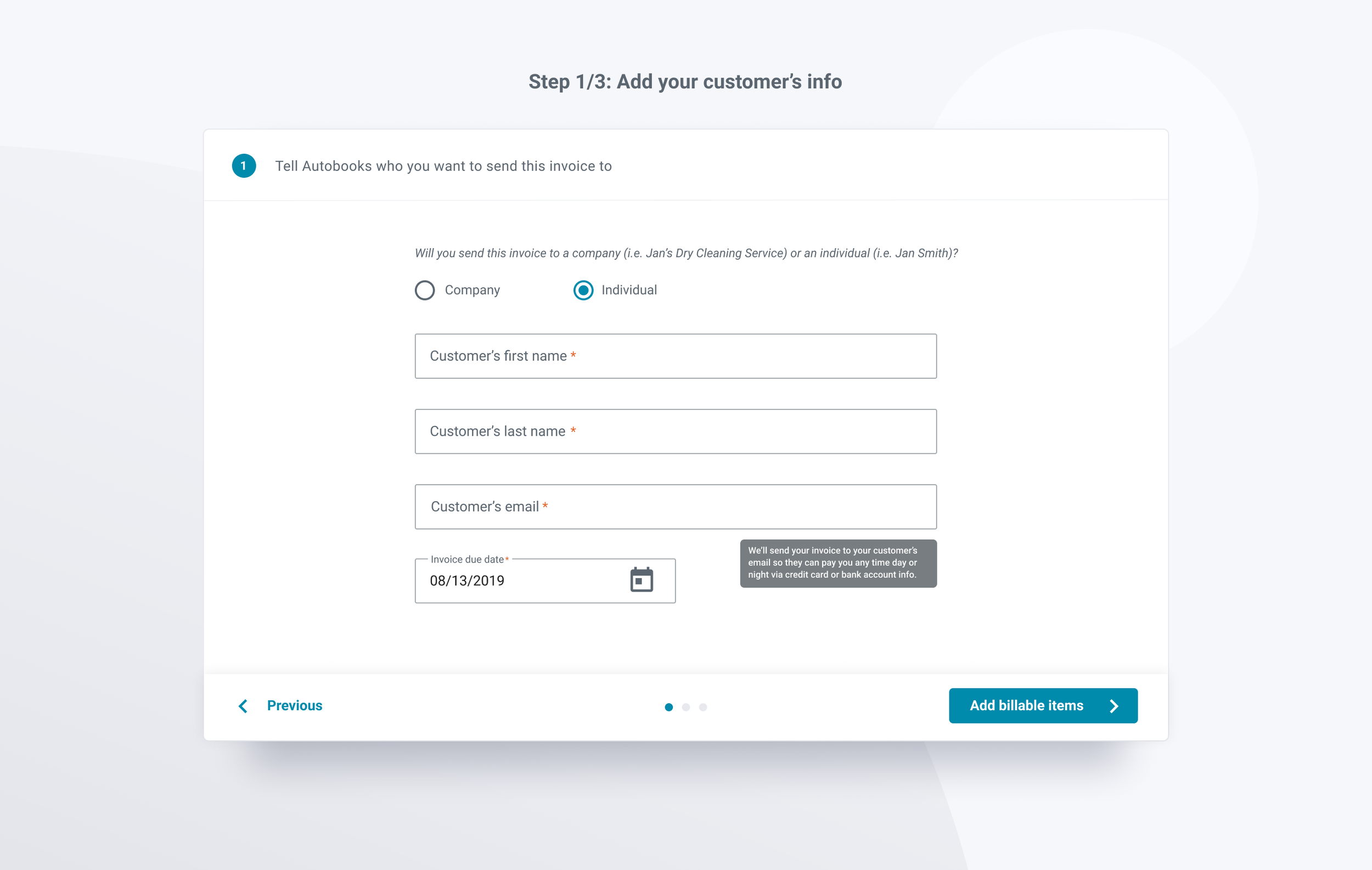
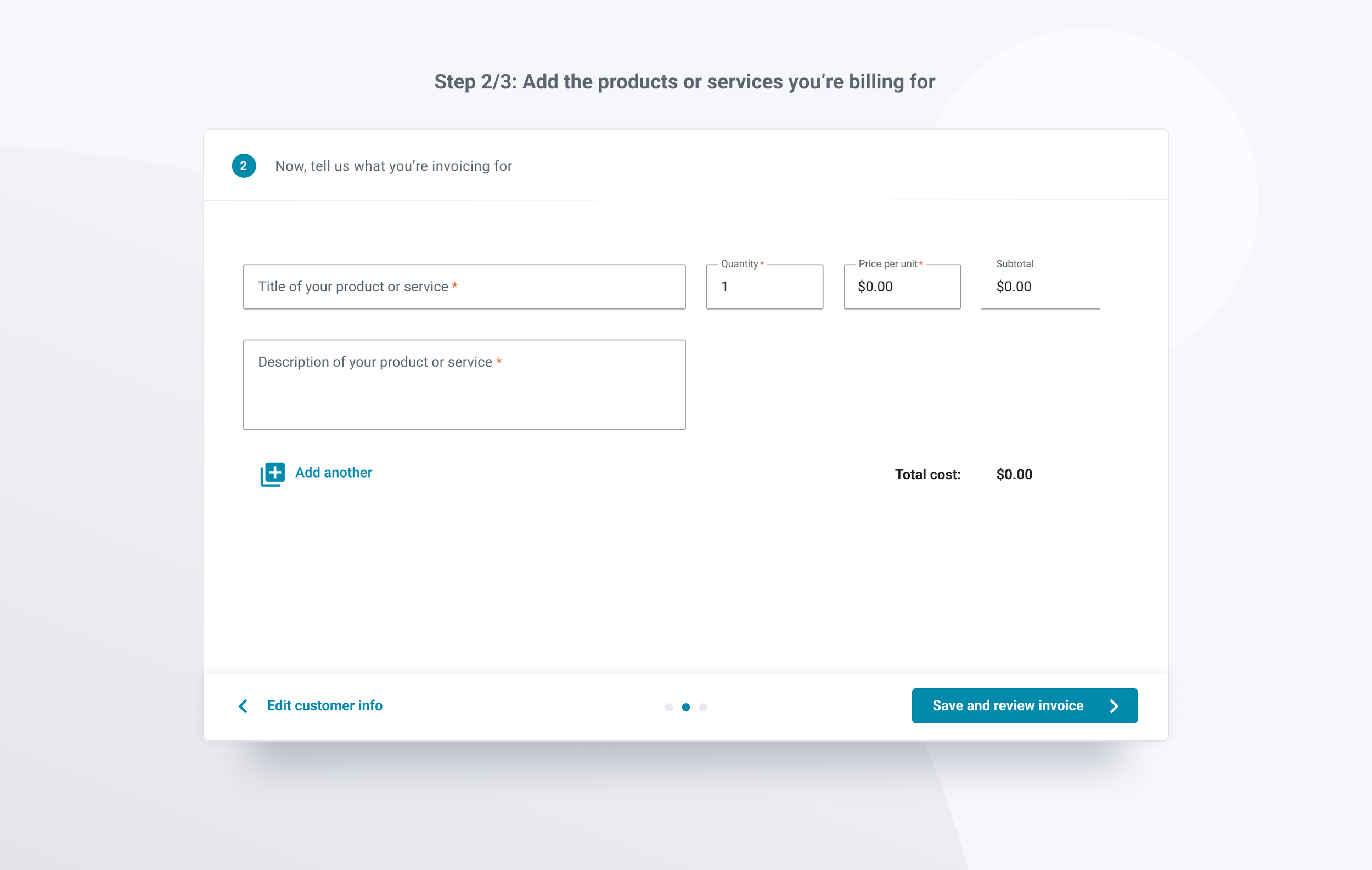
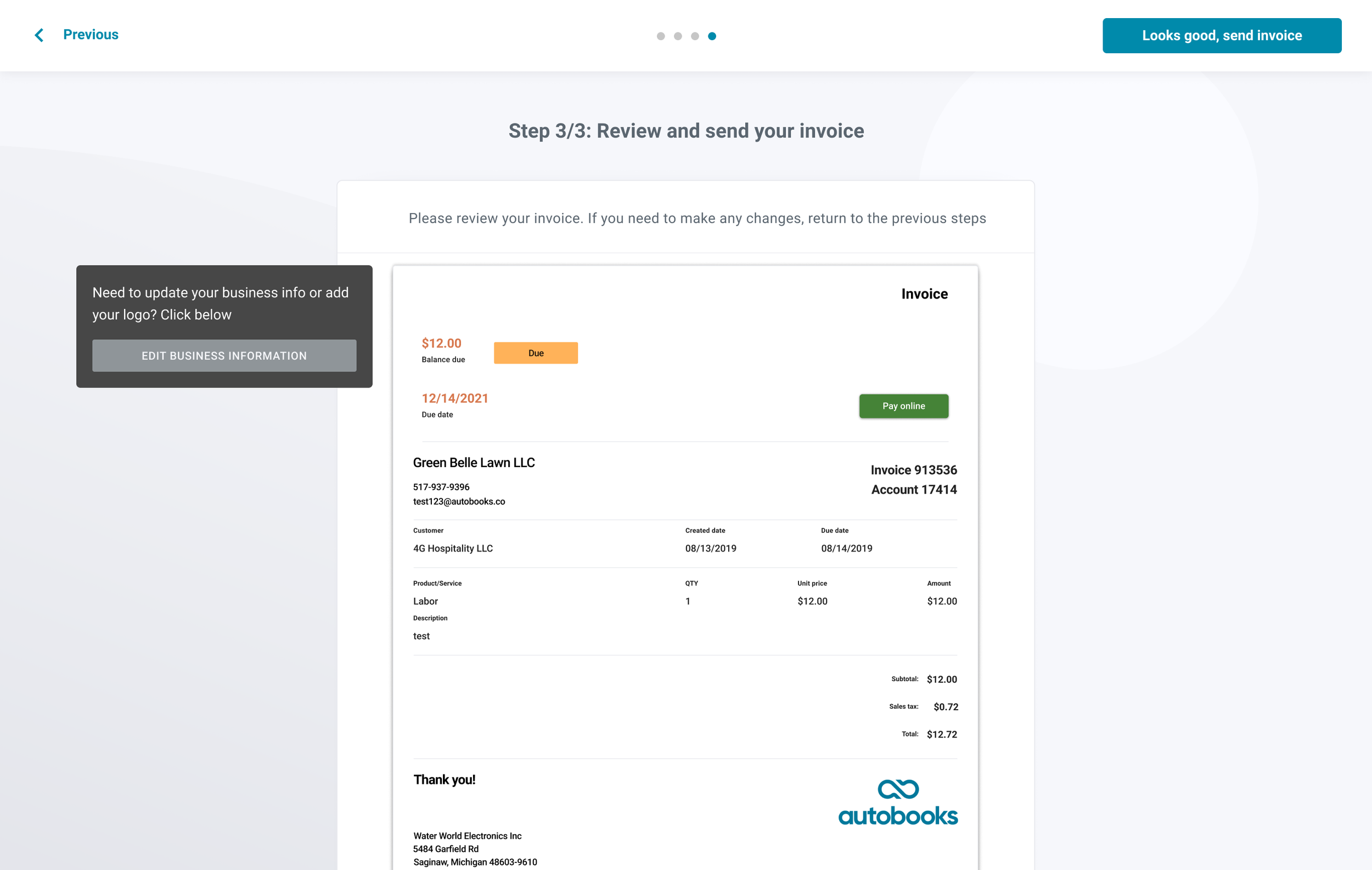
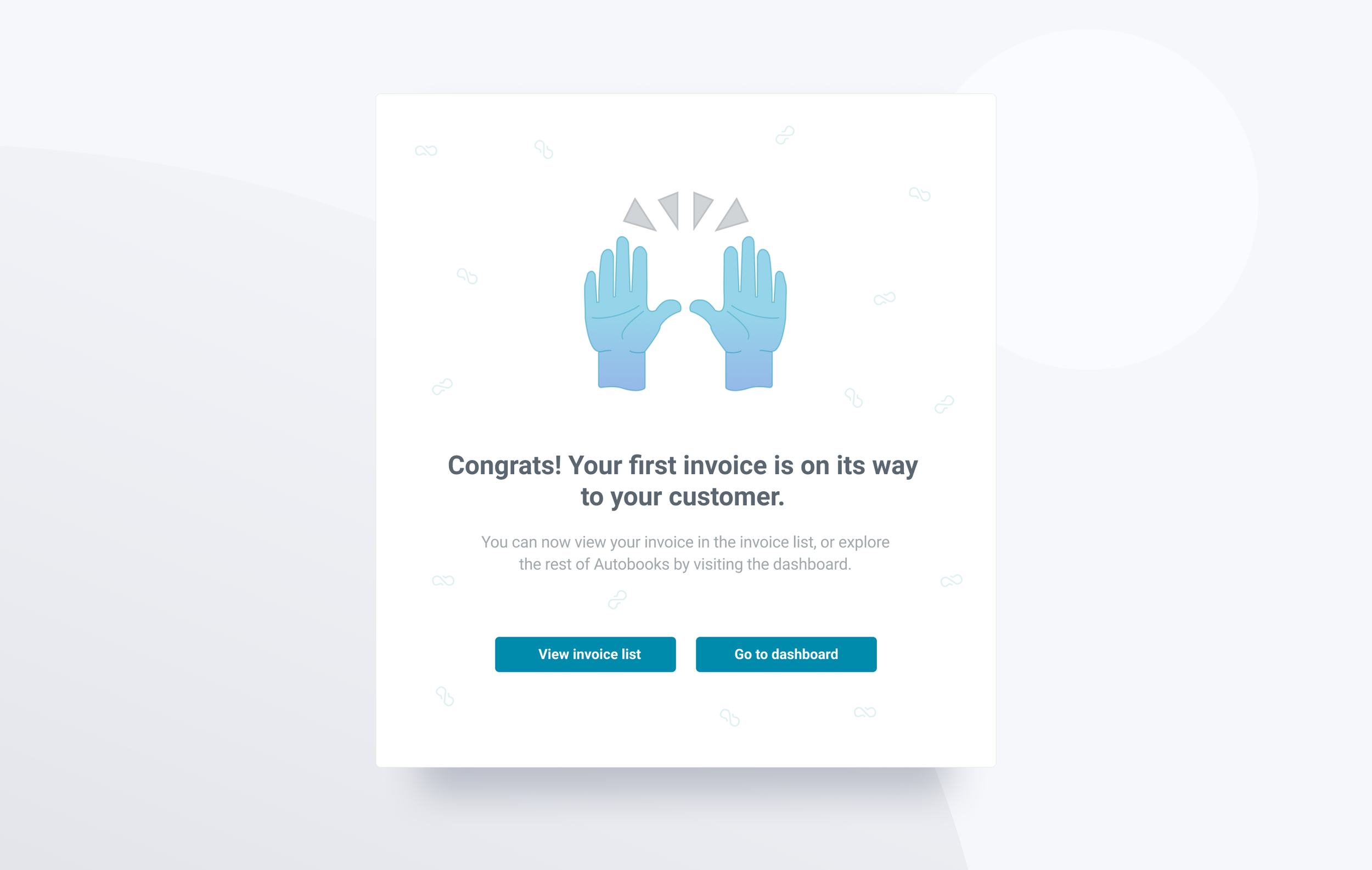
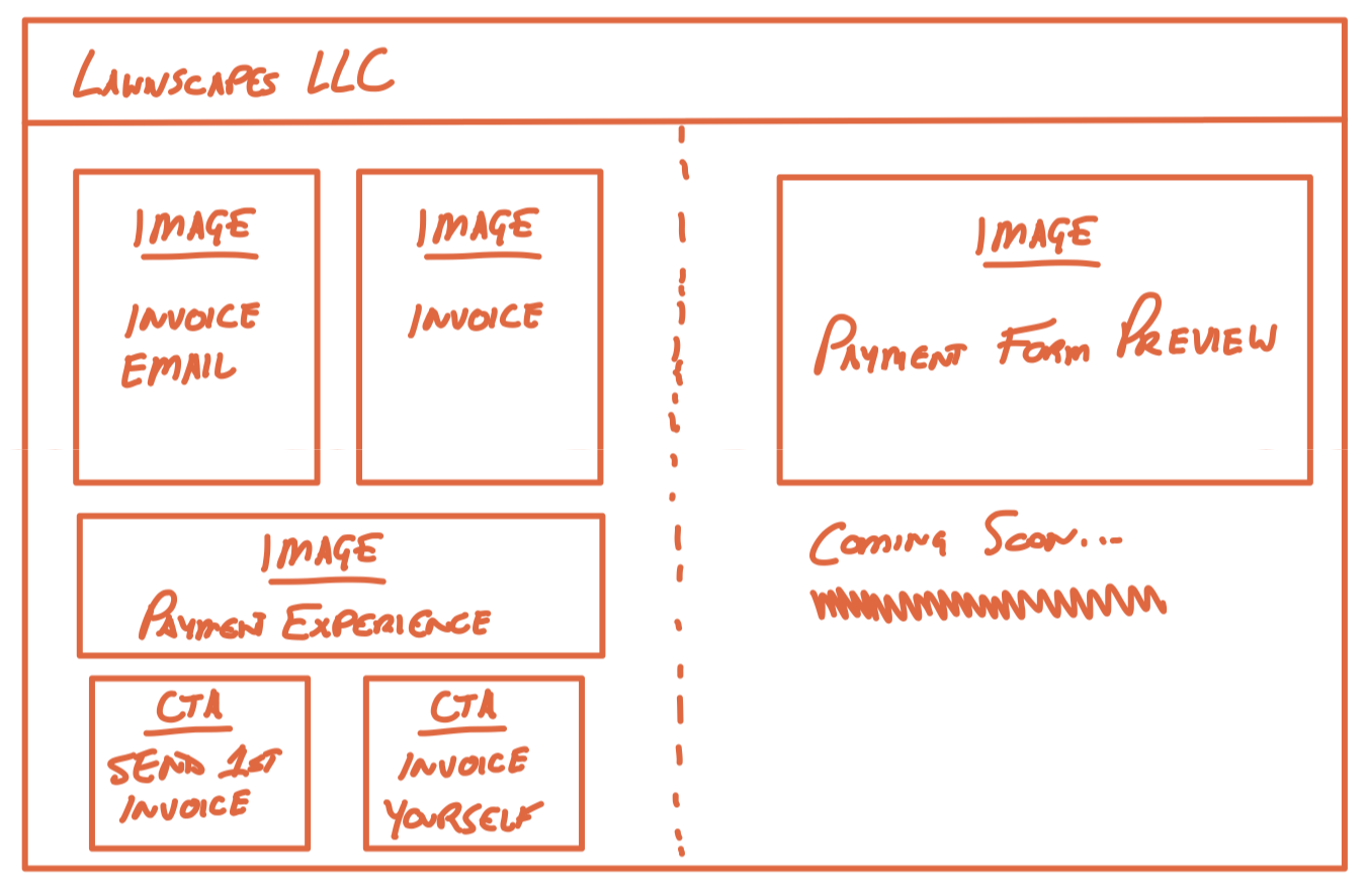
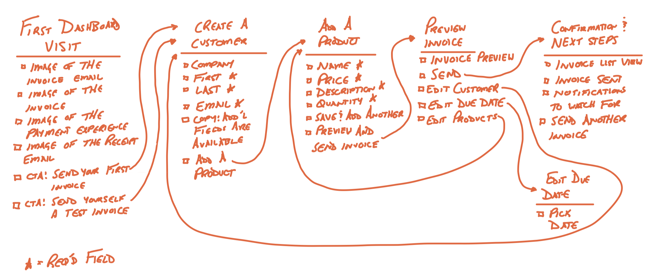
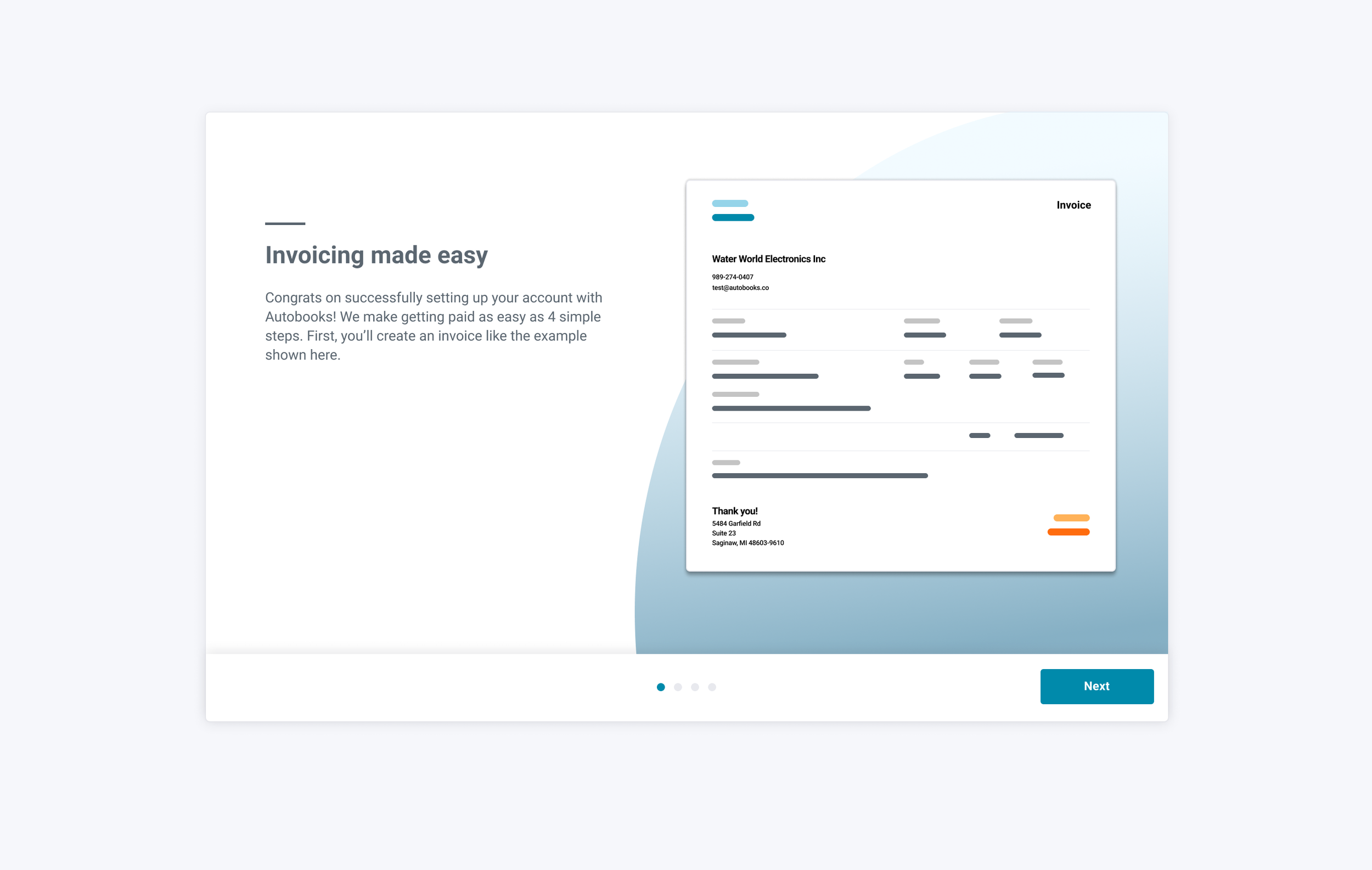
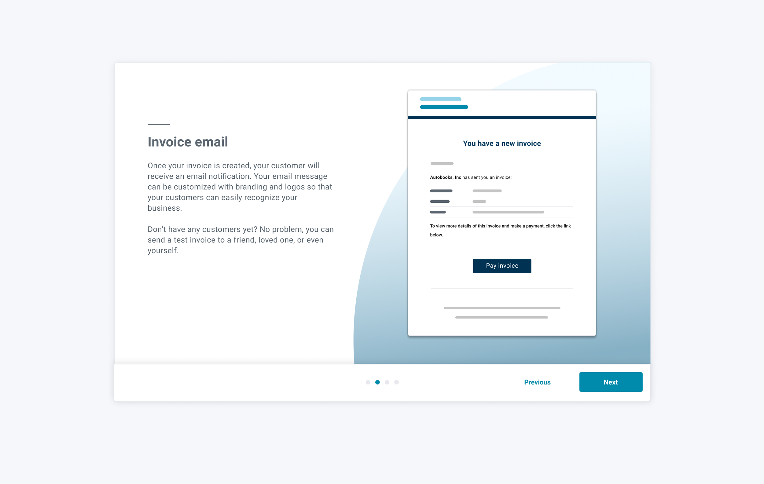
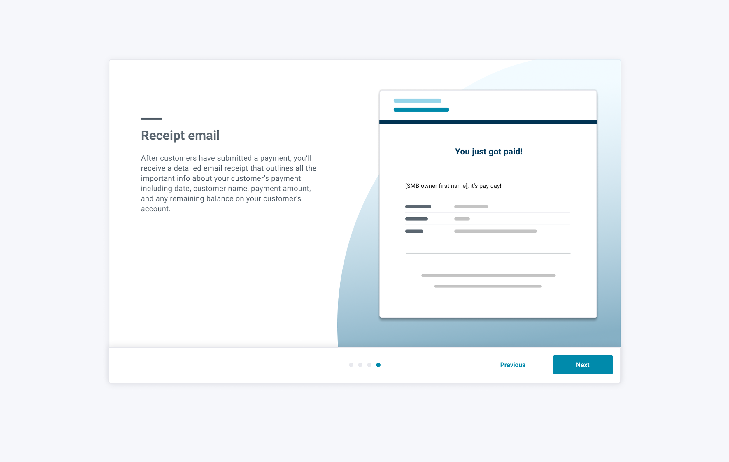
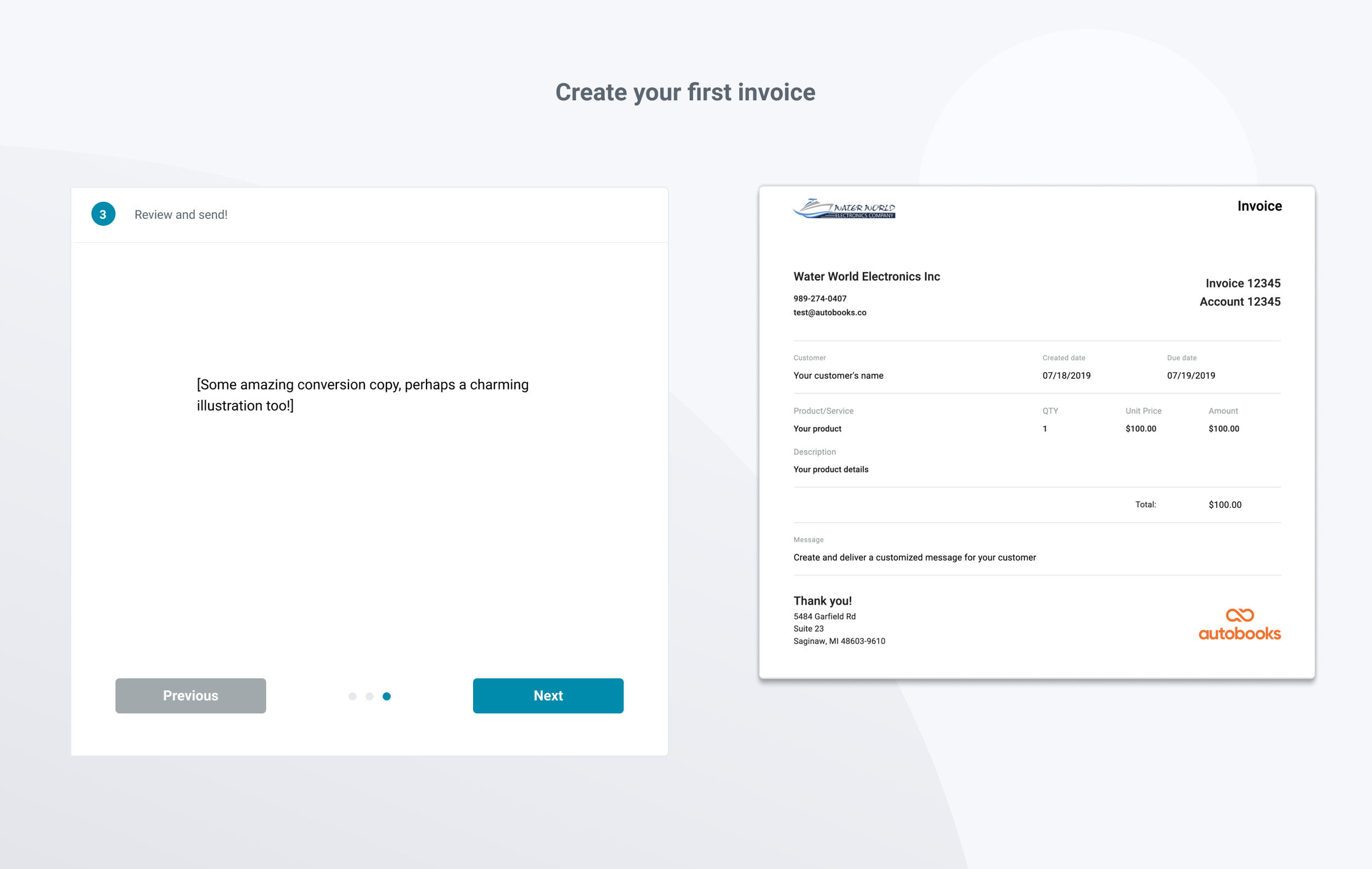
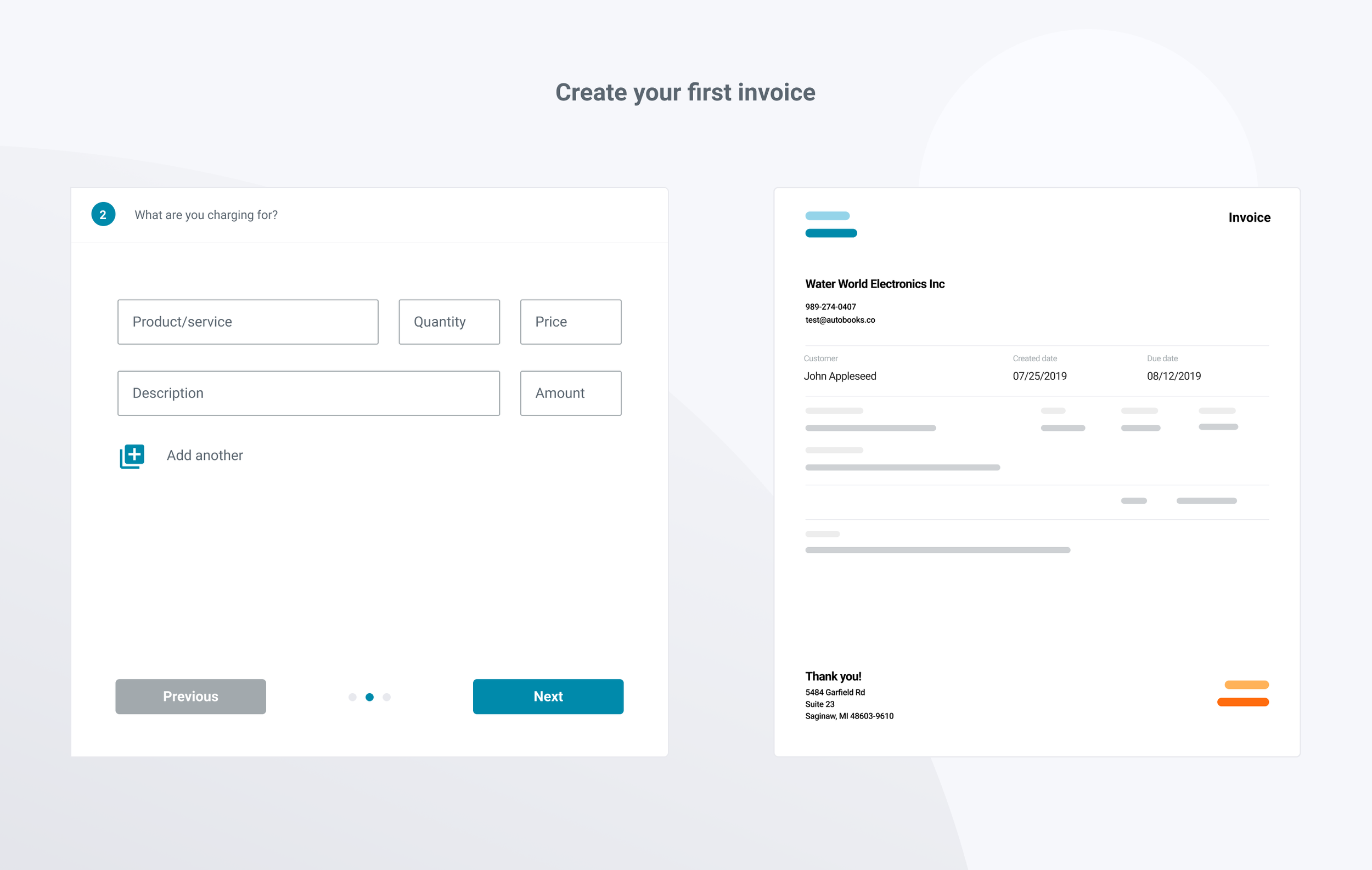
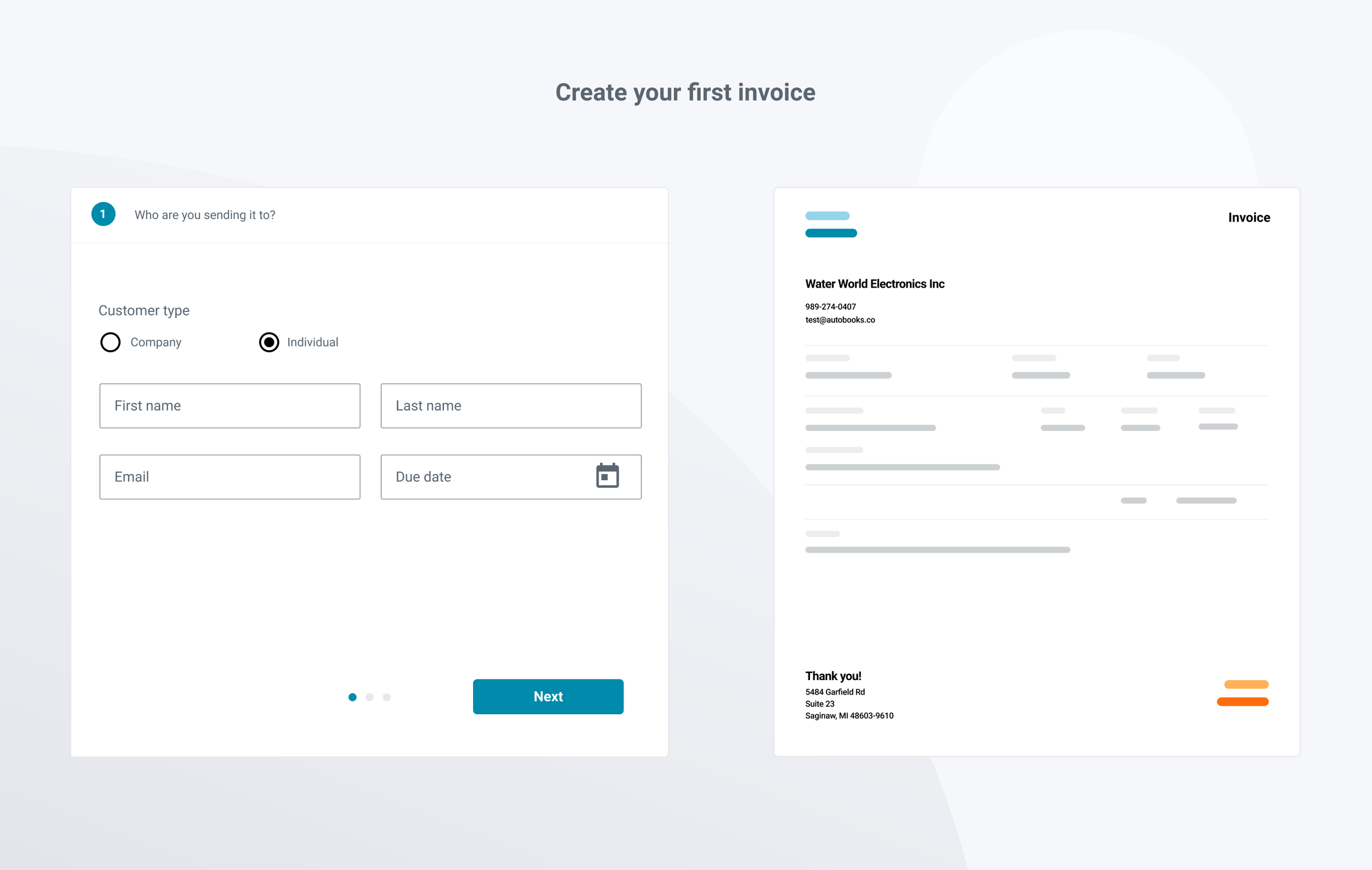
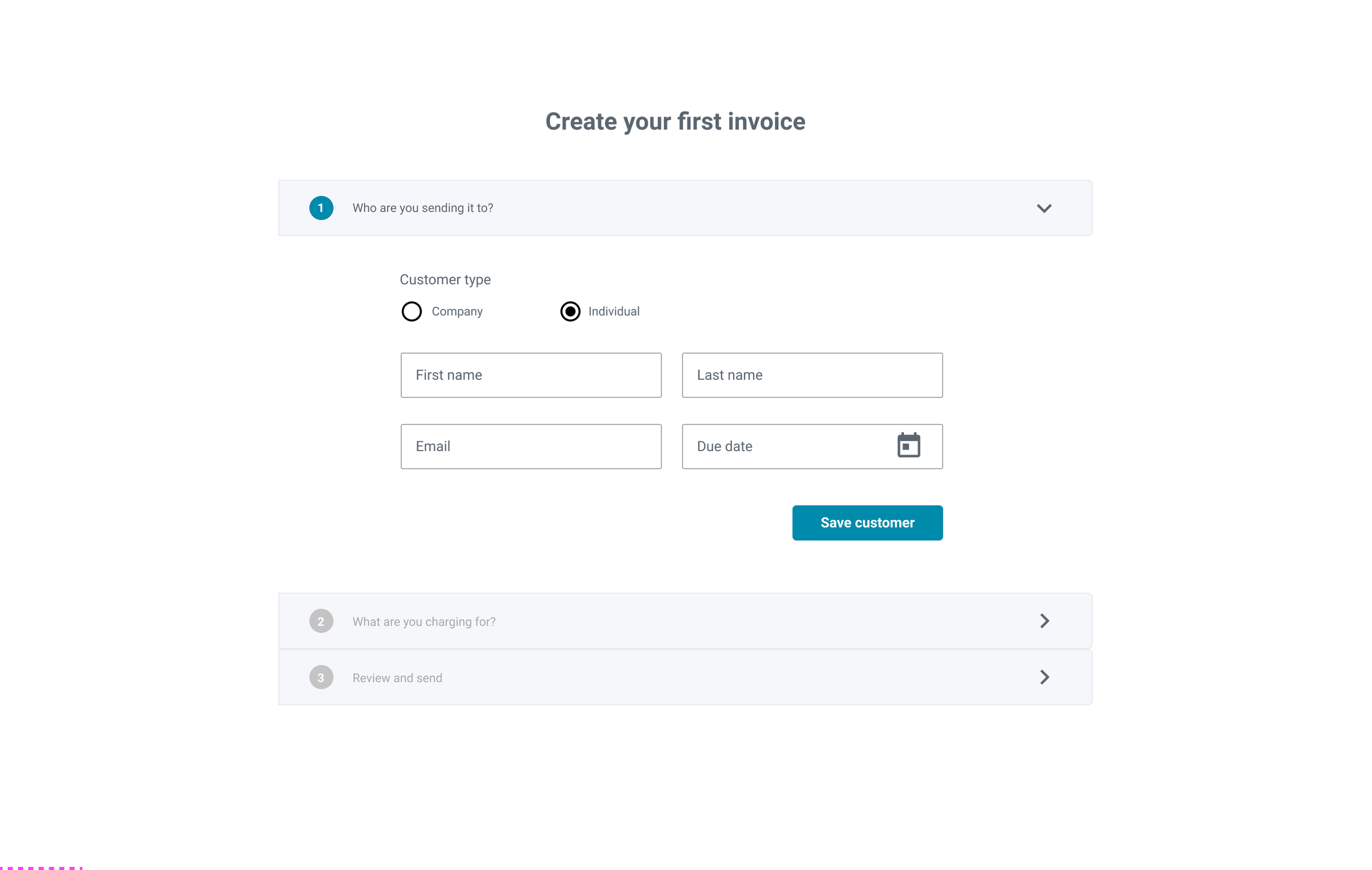
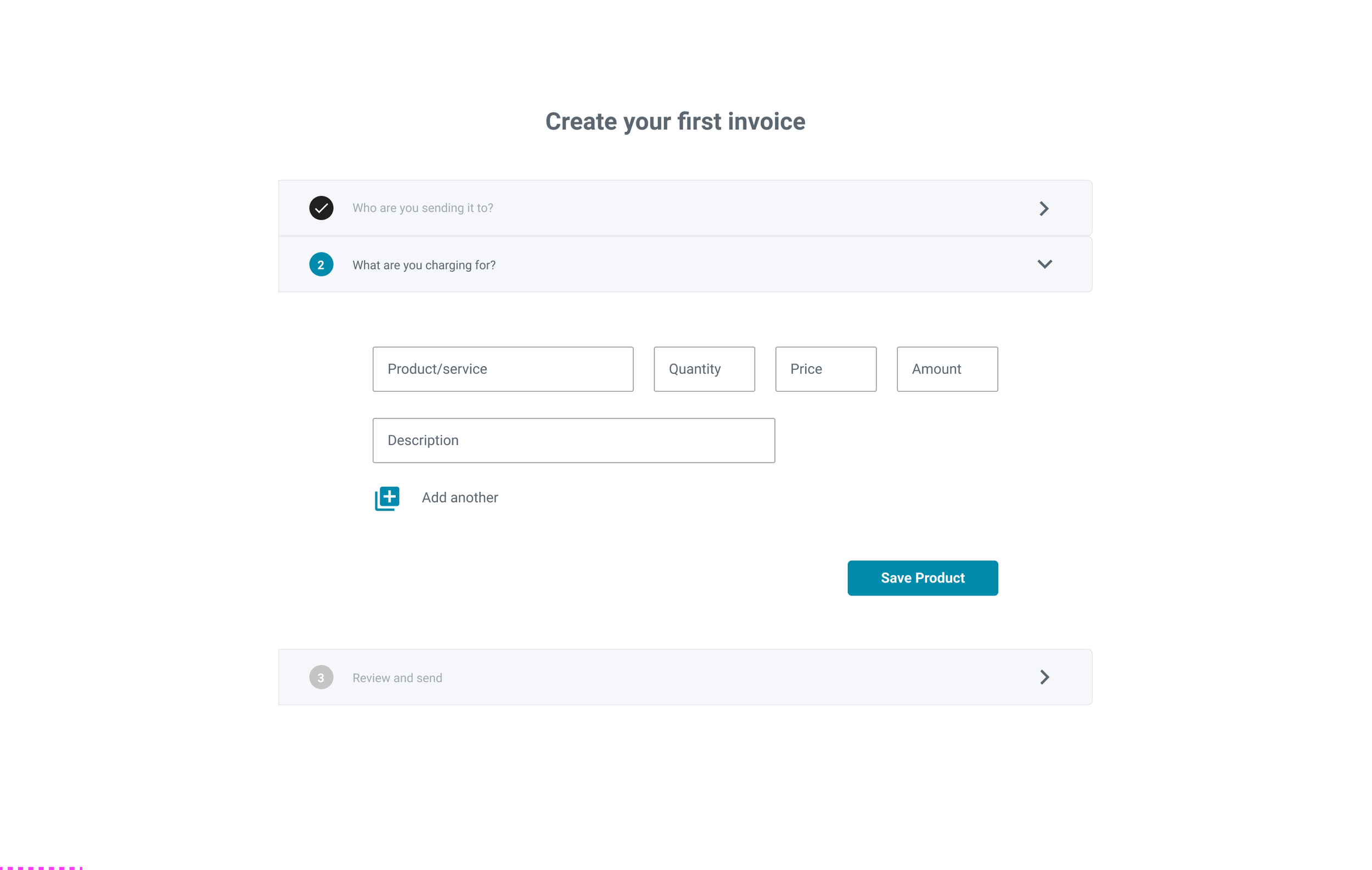
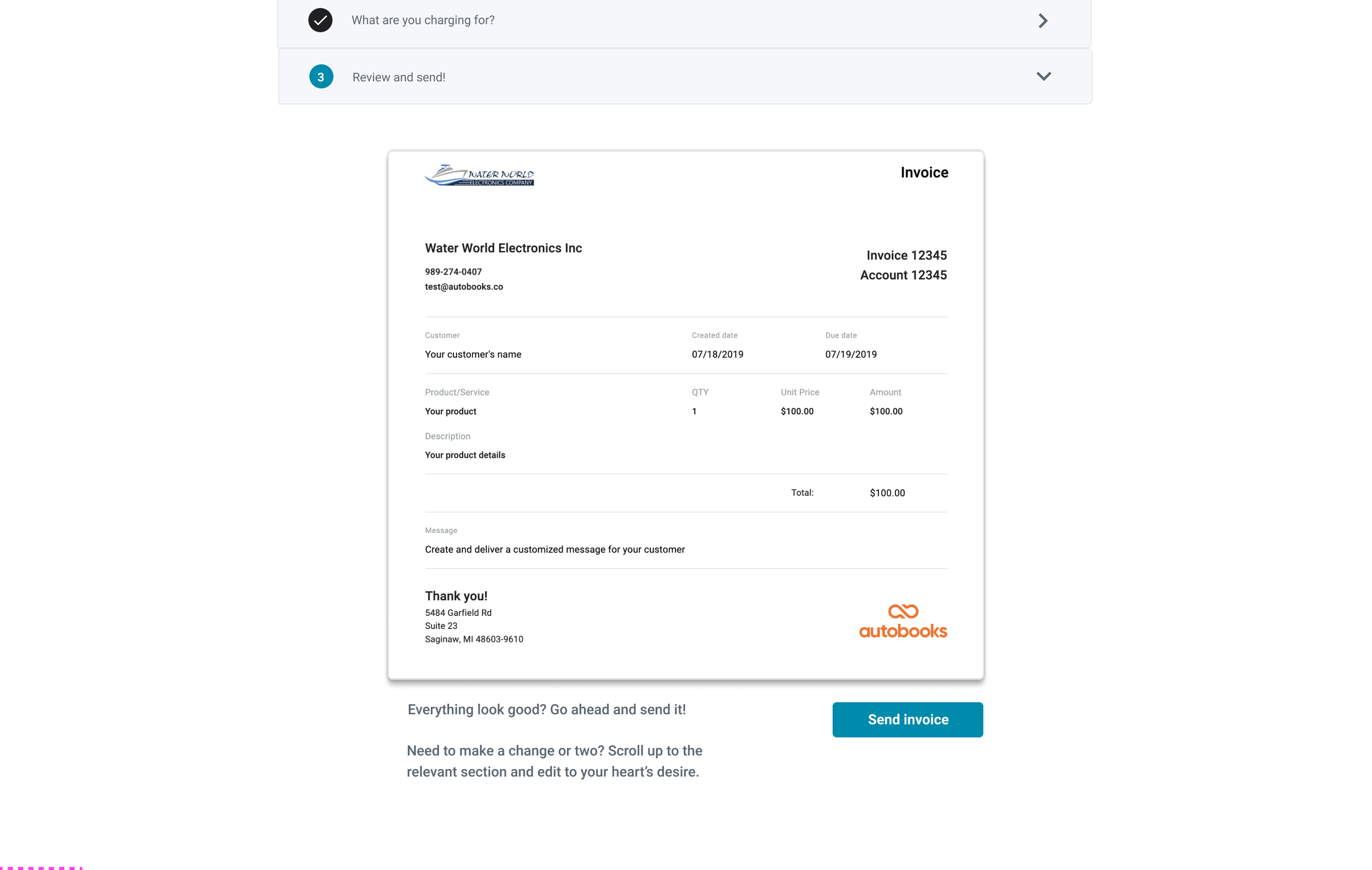
I designed a flow that led users through the creation of their first invoice, one step at a time. First, users landed on an introduction screen that explained what the First Time Invoice experience was, and why it was important for setting up their Autobooks account. After the introduction screen users added a Customer to whom their first invoice would be addressed and sent. Next, users added products and/or services to their invoice. Each product line item required a title, quantity, price per unit, and item description. Finally, users were shown a preview of what their customer would see when they received the invoice, as well as a CTA to send the invoice. Optionally, users could scroll down the preview page to see a detailed account of what their customer's invoice email, payment experience, and receipt email would look like. Once users clicked the Send Invoice CTA, the landed on a confirmation screen that explained that their invoice had been successfully sent, as well as prompted users to explore either the main Autobooks Dashboard, or view their newly sent invoice in the Invoice List.
Process
Stakeholder Requirements
Create a clear path for new users to follow towards sending their first invoice
Allow users to create a customer, add a product, and preview the invoice before sending.
Make it clear to the user that their customer will know the invoice is sent from the user
Alleviate user anxieties around whether their customers will trust the invoice enough to make payments online
Show users what the sent invoice would look like to their customers upon receiving it


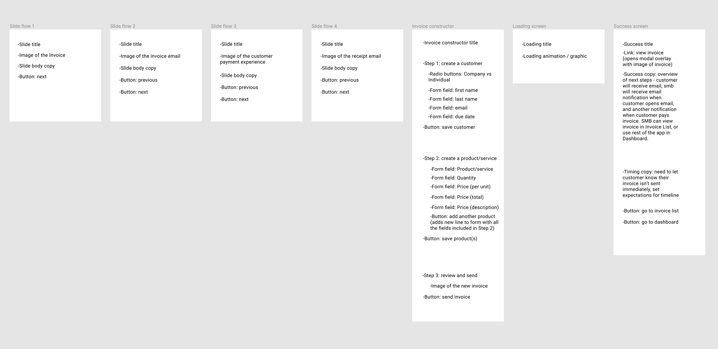
Option 1. Explain Invoice Creation via Slides
One of the greatest challenges to this problem was balancing the need to assuage user anxieties with a desire to guide them through the creation of their first invoice as efficiently as possible. Early versions included a click-through slide show that detailed each step of the end-customer's experience of receiving an invoice, followed by a single invoice constructor page. However, we decided that If we leaned too much on explaining what a user's customer would see after receiving an invoice, the experience would get bogged down with copy and we'd experience low conversion. This was exacerbated by an already-lengthy onboarding process at the time this feature launched.
Option 2. Provide invoice visual during creation
We also considered a version where users would see a preview of their invoice that would dynamically update as they filled out the necessary fields to create their invoice. Ultimately, we decided that the design would not be up to our standards of responsiveness for mobile users due to the reliance on a wide viewport.
Option 3. Use a vertical accordion to divide sections
If we only focused on creating the invoice, users might have abandoned the flow due to fears of what would happen once their first invoice was sent. One alternative option was a vertical invoice constructor that would expand and collapse as users progressed through each step. We liked the idea that users would be able to access any part of the invoice creation form from one screen, but were leery of hiding / showing content conditionally, as well as the risk of requiring multiple tiers of vertical scroll tracks of viewers added multiple products/services to their invoice.
Lessons Learned
During the course of this project, we went through several significant design changes mid-cycle. While this amount of iteration is to be expected for net-new functionality, making these decisions in-cycle led to problems with the Engineering team needing to scrap code and make costly technical changes. After seeing the stress this put on the Engineering and QA teams near the end of the cycle, I learned to push design discussions and iterations with stakeholders well ahead actual project kick-offs, leading to less wasted code on subsequent projects.