Design Problem Hypothesis
Payments made to small business owners (SMB's) through Autobooks take 2-3 business days to settle into SMB accounts. For SMB's with limited cashflow, waiting multiple days for payments to settle can hinder their ability to purchase supplies, pay employees, and fund new projects. Our goal was to create a premium, opt-in tool that would allow users to bypass the standard 2-3 business day settlement period and receive funds instantly in their business checking account. This tool, dubbed Instant Payment Mode, would cost an additional 1% per transaction in processing fees and require users to submit their debit card information, so we needed to create a landing page that would convey value, alleviate anxieties, and drive conversion.
Role
I was the sole Product Designer on this project. The other team members I worked alongside were:
SVP Product, Product Managers
Conversion Copywriter
Engineering Team
QA Team
Impact
Within the last 90 days, the Instant Payment Mode landing page converted at 13% on desktop, and a whopping 31% on mobile. Likewise, Instant Payment Mode generated $243,093 in additional revenue for Autobooks in 2023.
“Instant Payment Mode generated $243,093 in additional revenue for Autobooks in 2023”
Instant Payment Mode has been a boon to users by allowing them to bypass the standard 2-3 settlement period for payments made to their small business, increasing cashflow and making funds available faster. For greater flexibility, users are able to toggle the service on and off as their business needs change.
Solution
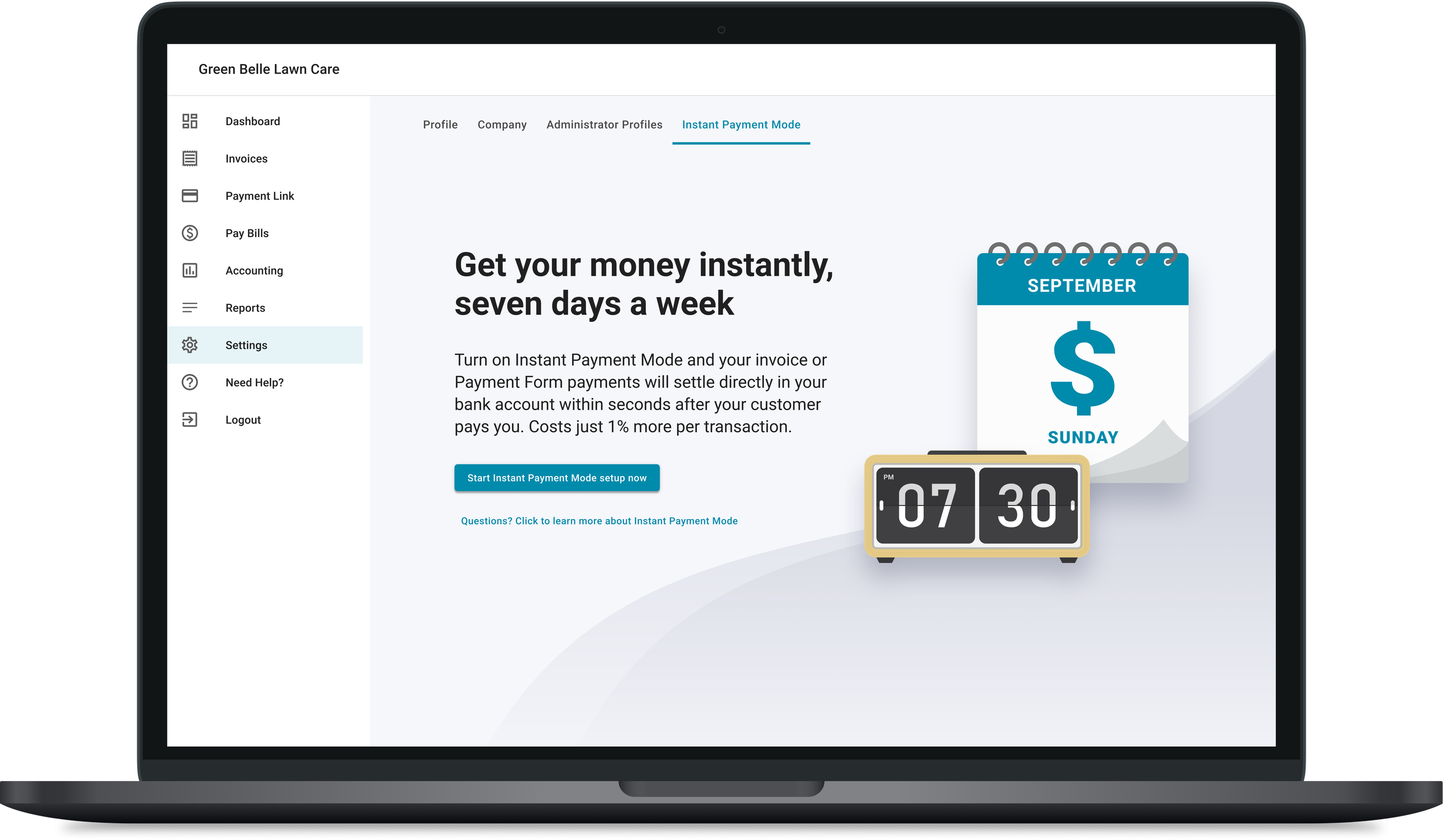
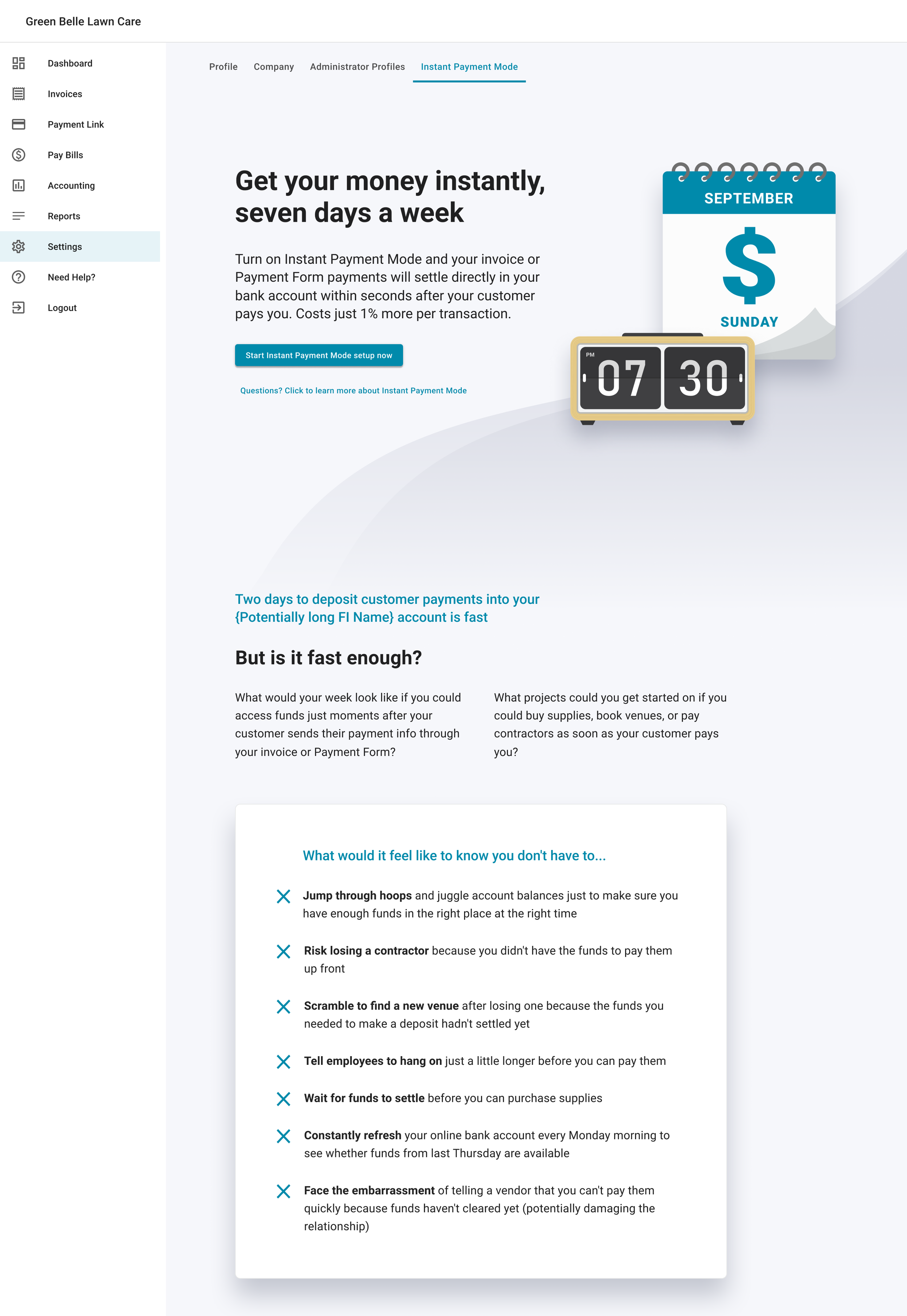
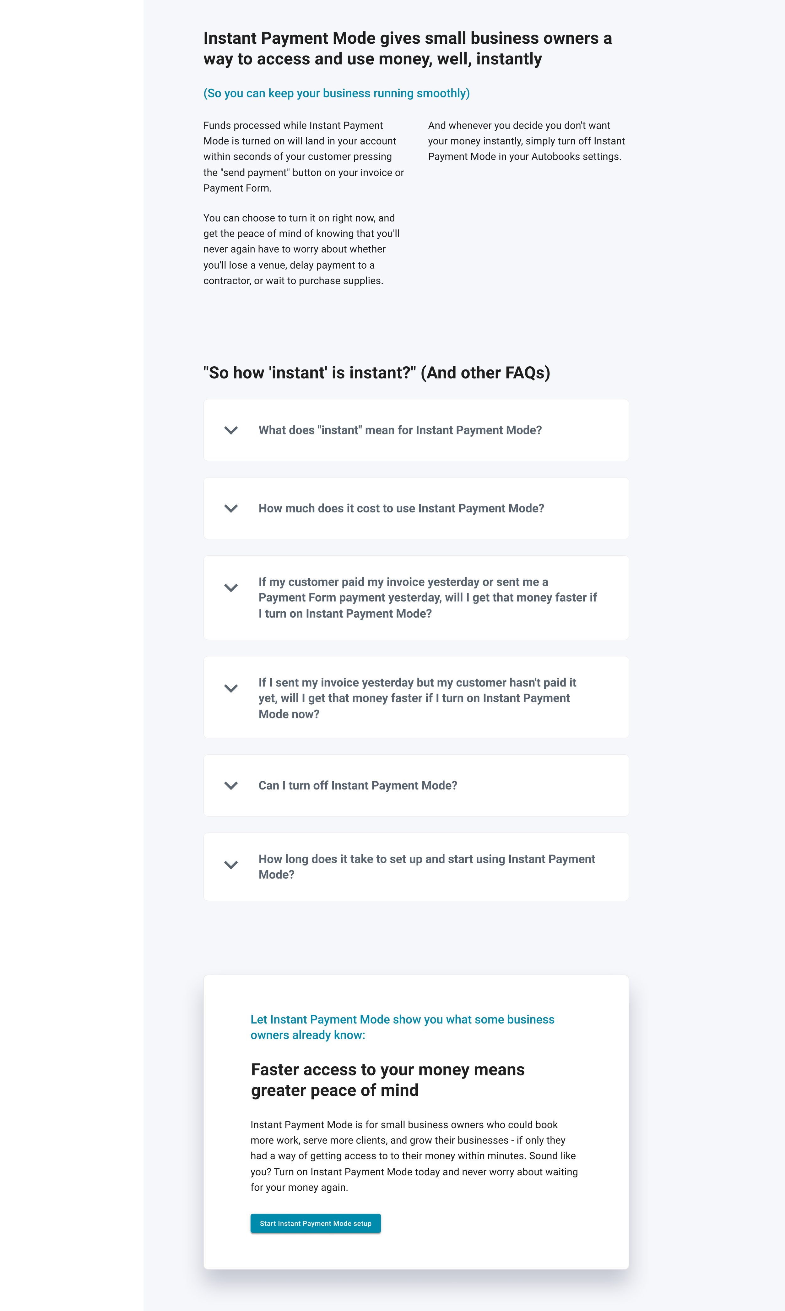
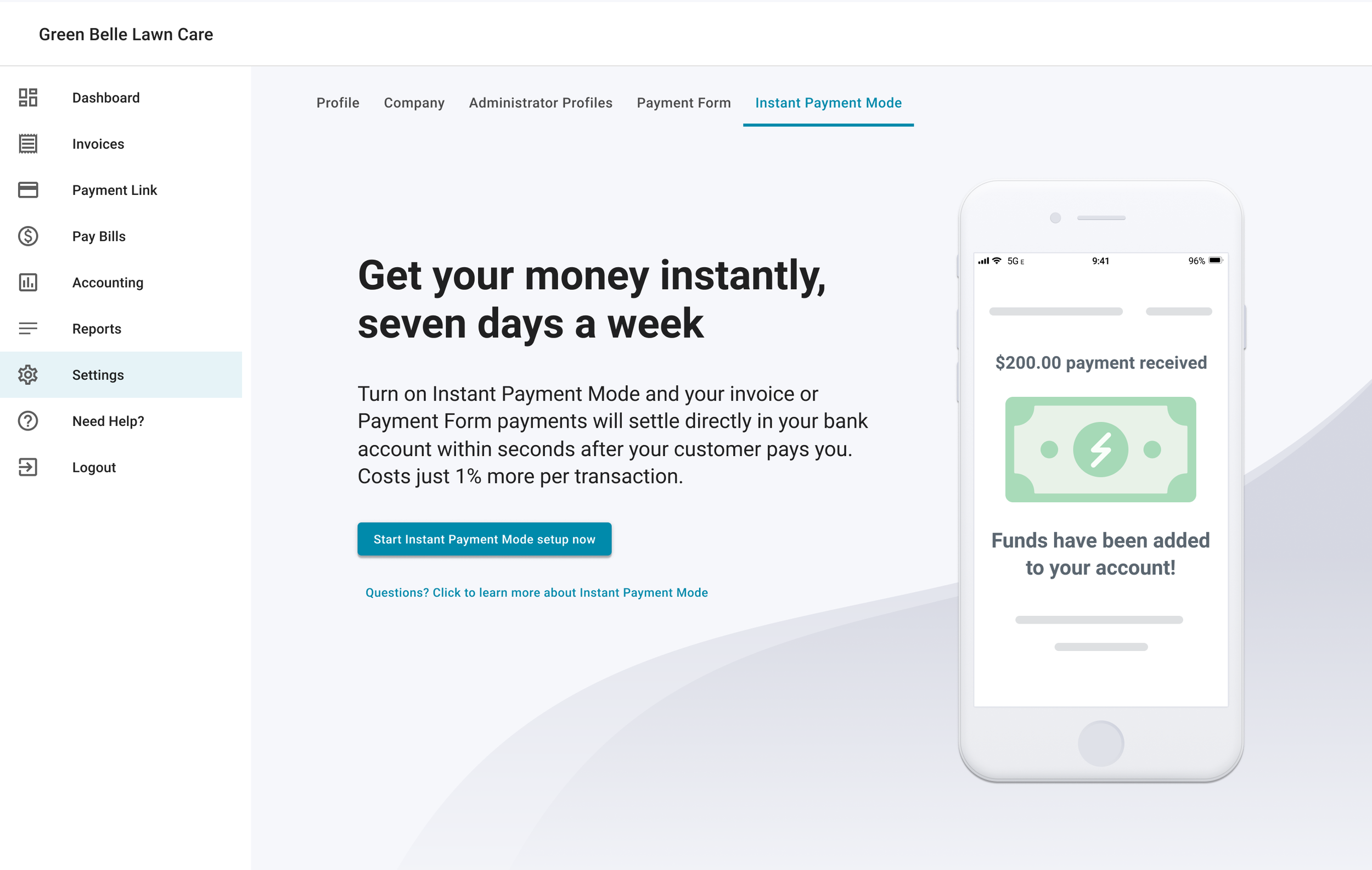
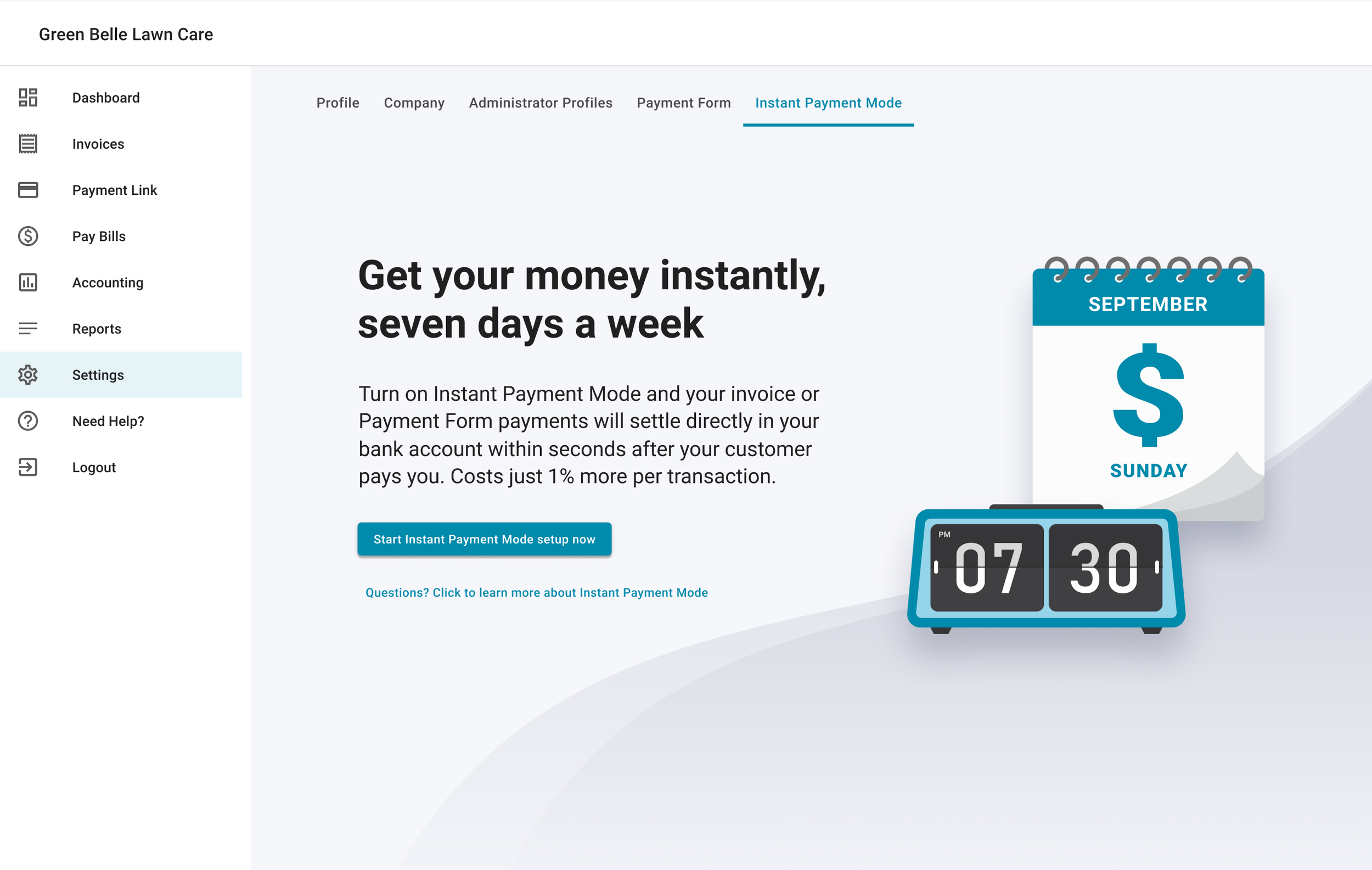
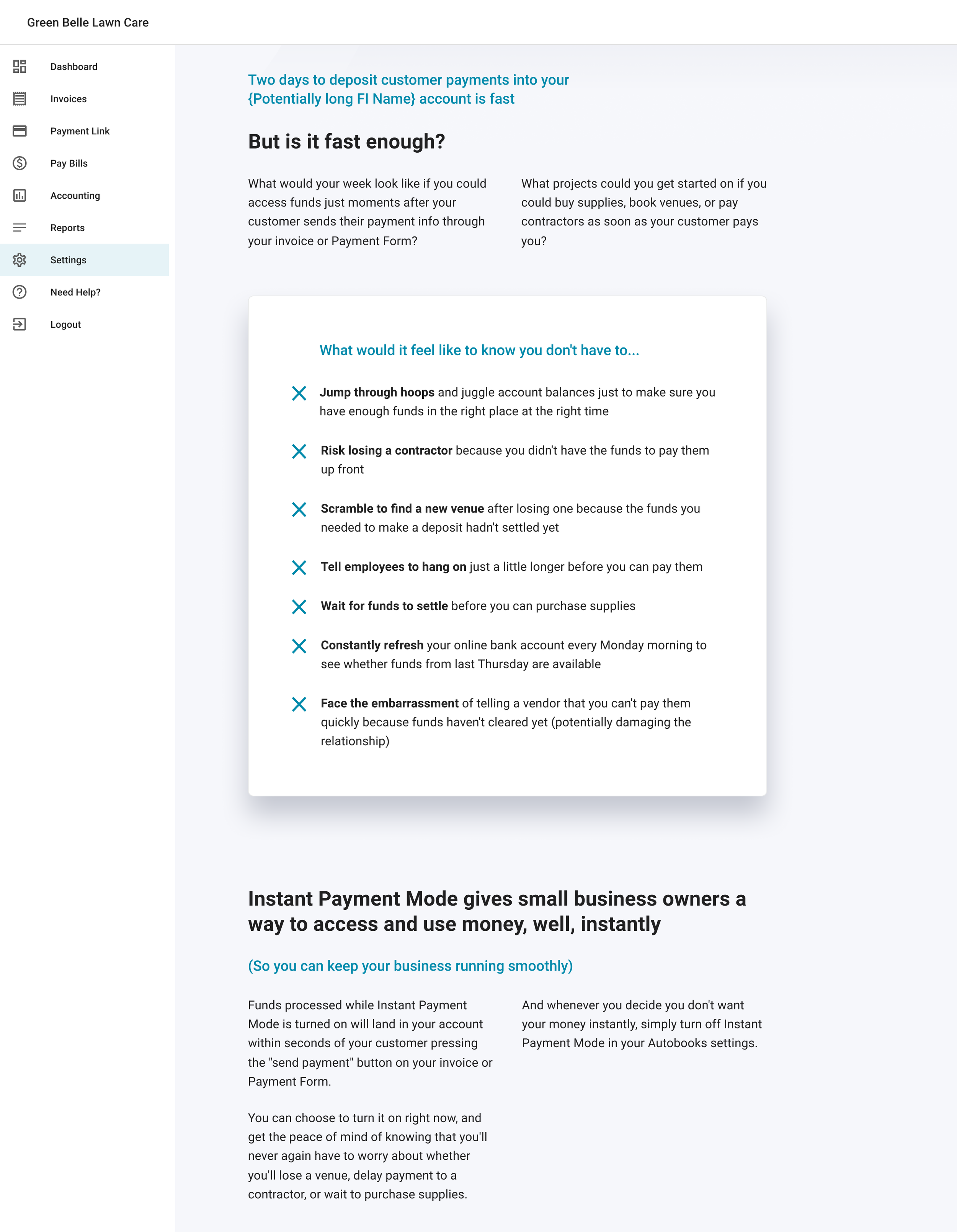
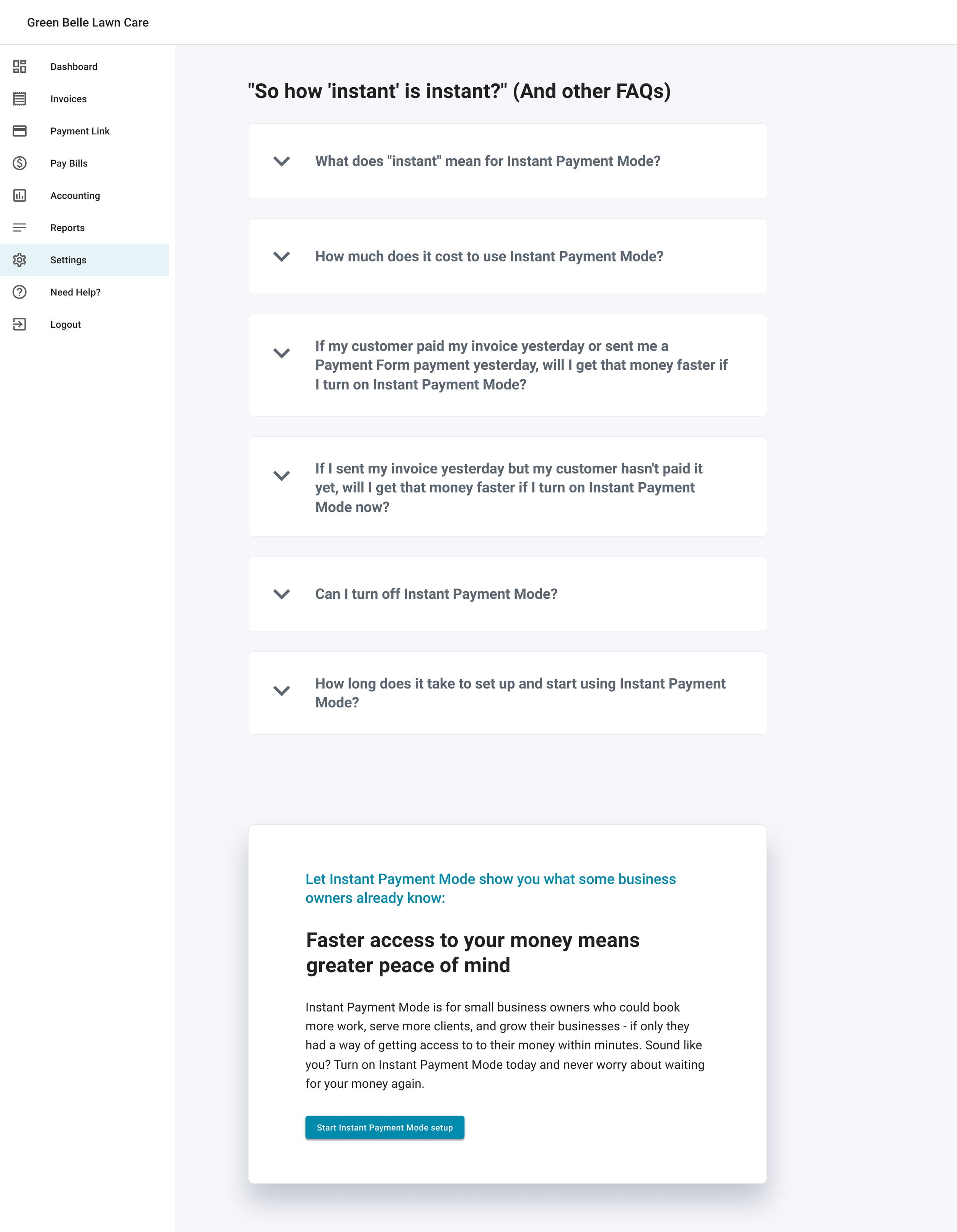
Because our goal was to upsell our users on this new feature, I designed the the sign-up page for Instant Payment Mode (IPM) as a conversion-focused landing page. Above the fold, content focuses on driving conversion with eye-catching visuals, compelling copy, and a clear signup CTA. If users click the secondary CTA, they'll be auto-scrolled below the fold where they can read more about the value IPM can offer their small business. The first section of supplementary copy highlights the pain points that users experience when their funds take multiple business days to settle. The next section breaks down what "instant" actually means in IPM in comparison to standard settlement periods, and follows up with a list of FAQ drawer cards. The page ends with another conversion-driving card so that users don't have to scroll back to the top of the page to sign up for IPM.
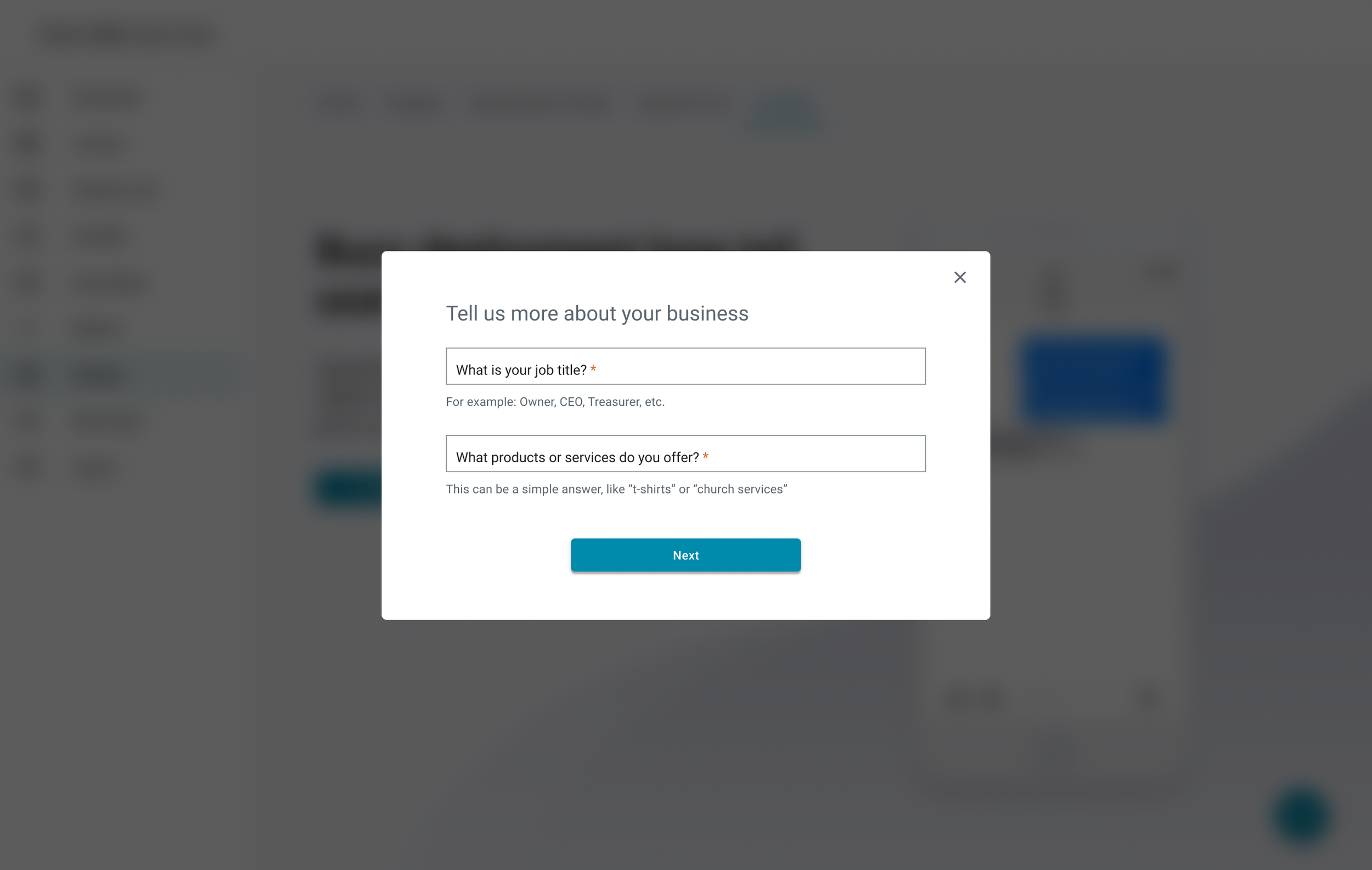
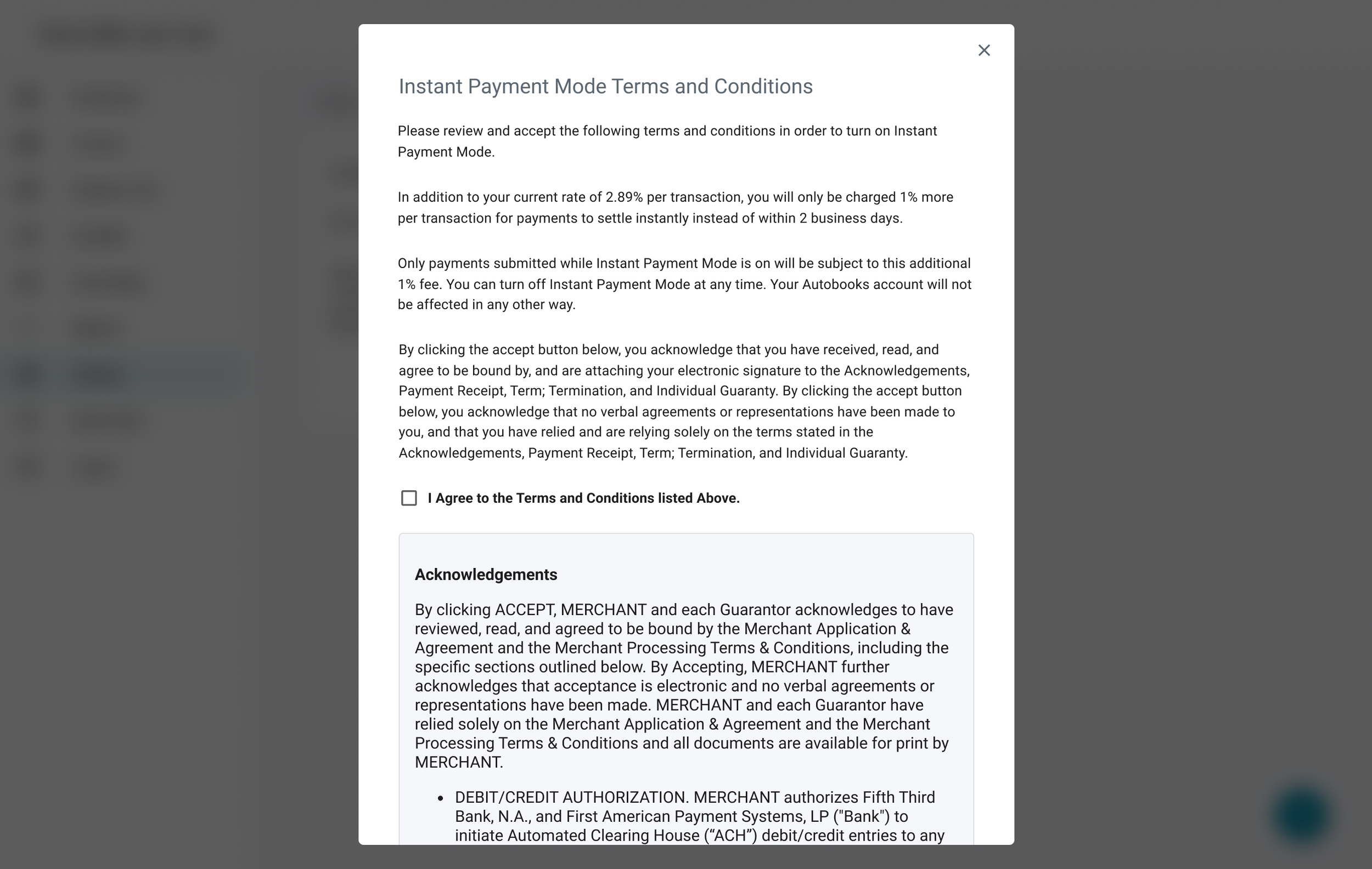
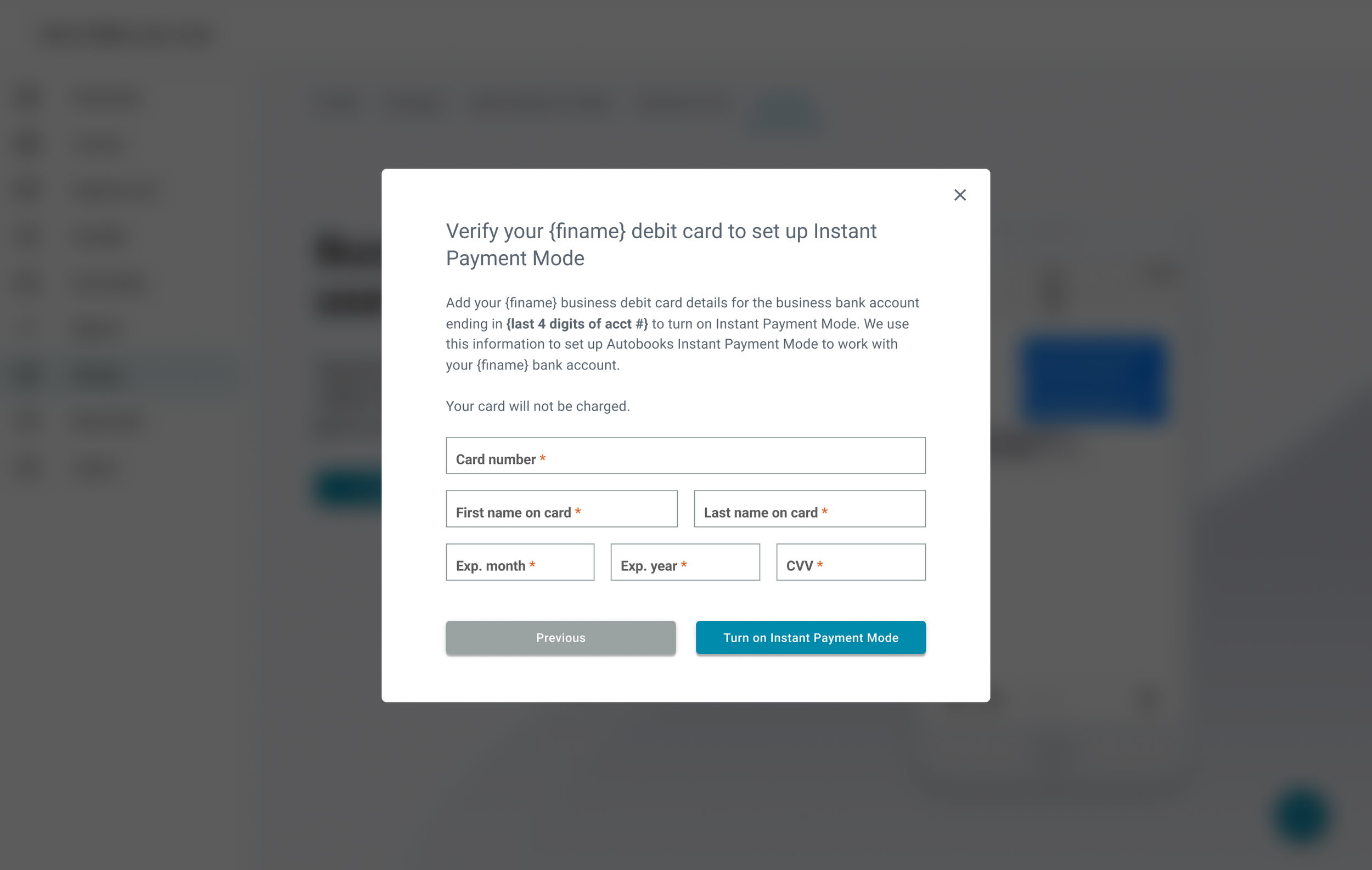
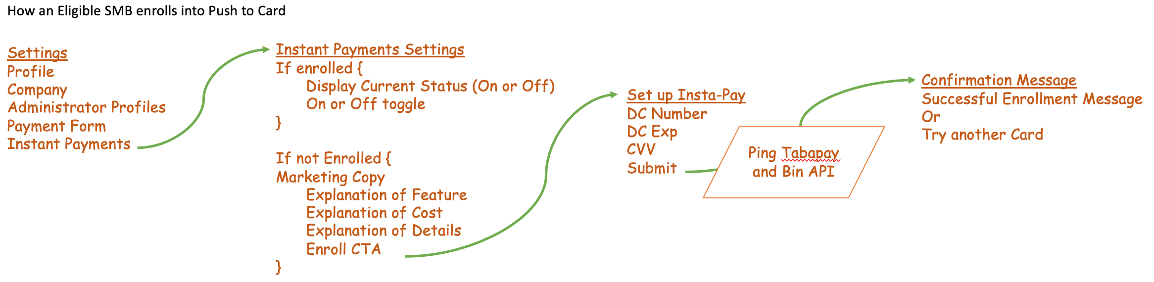
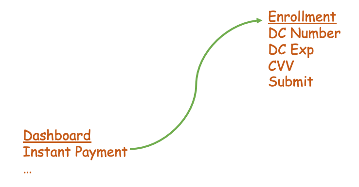
When users click the signup CTA they're taken through a segmented modal signup flow in which Job Title, Types of Goods Sold, and Debit Card number are collected. Given the sensitivity of asking for debit card information, we included copy on this section how Autobooks uses their debit card to power IPM securely.
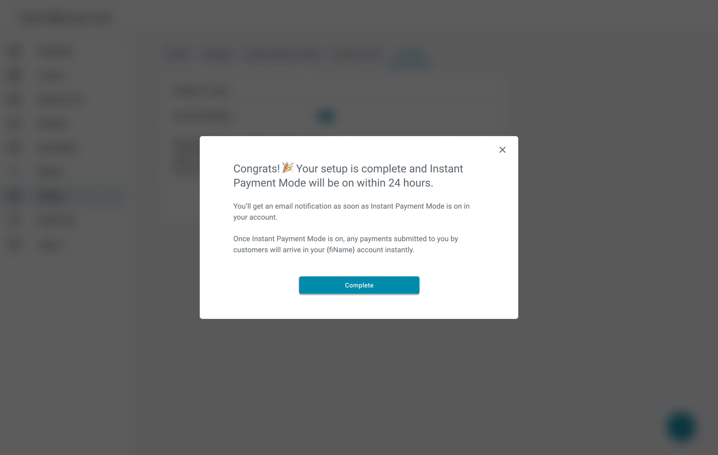
After users sign up for IPM, it can take up to 24 hours for IPM to activate. During this period, users will see a pending state version of the IPM page which explains what will happen once IPM is activated, as well as a pending state notification on the Autobooks dashboard.
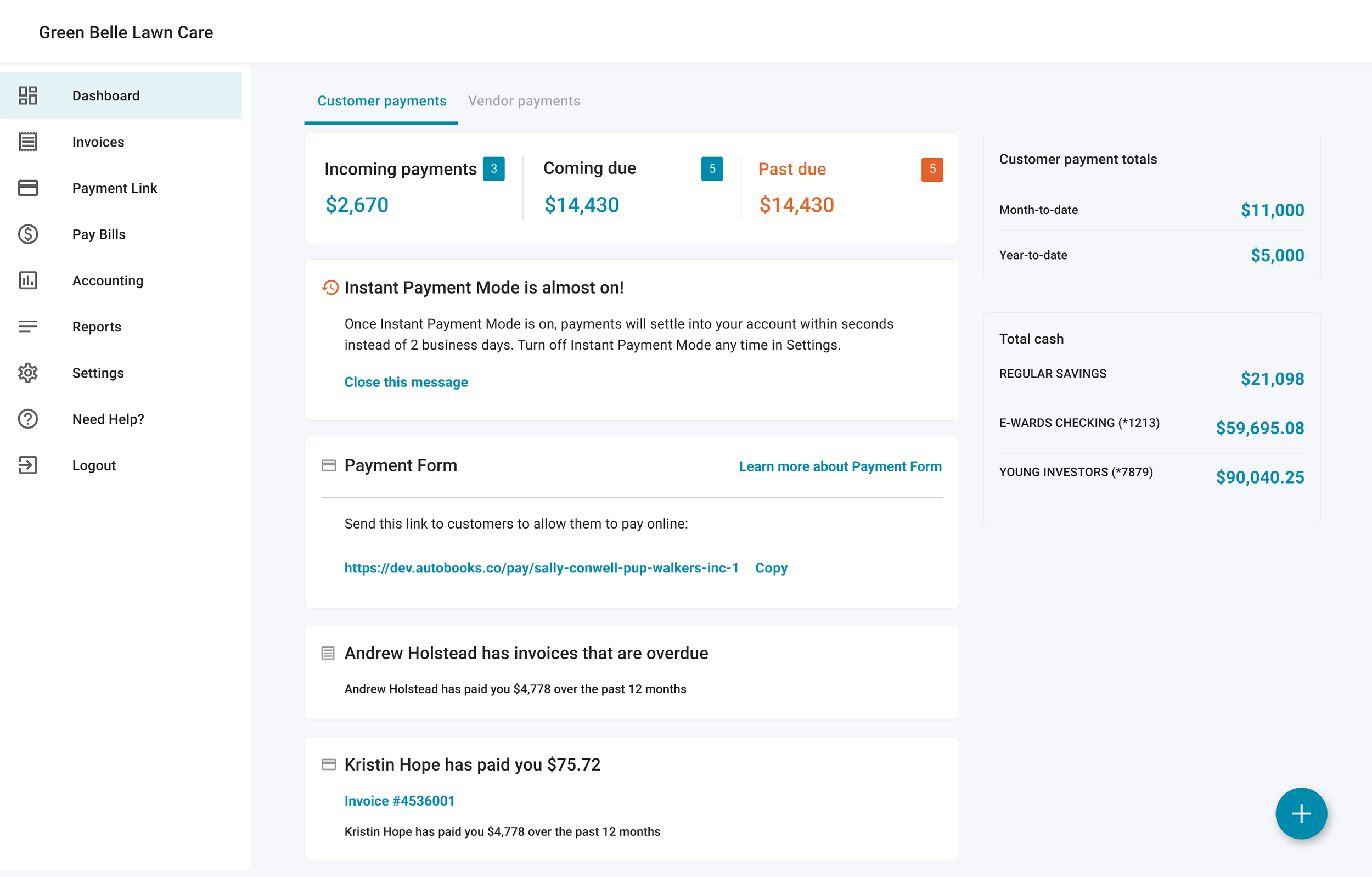
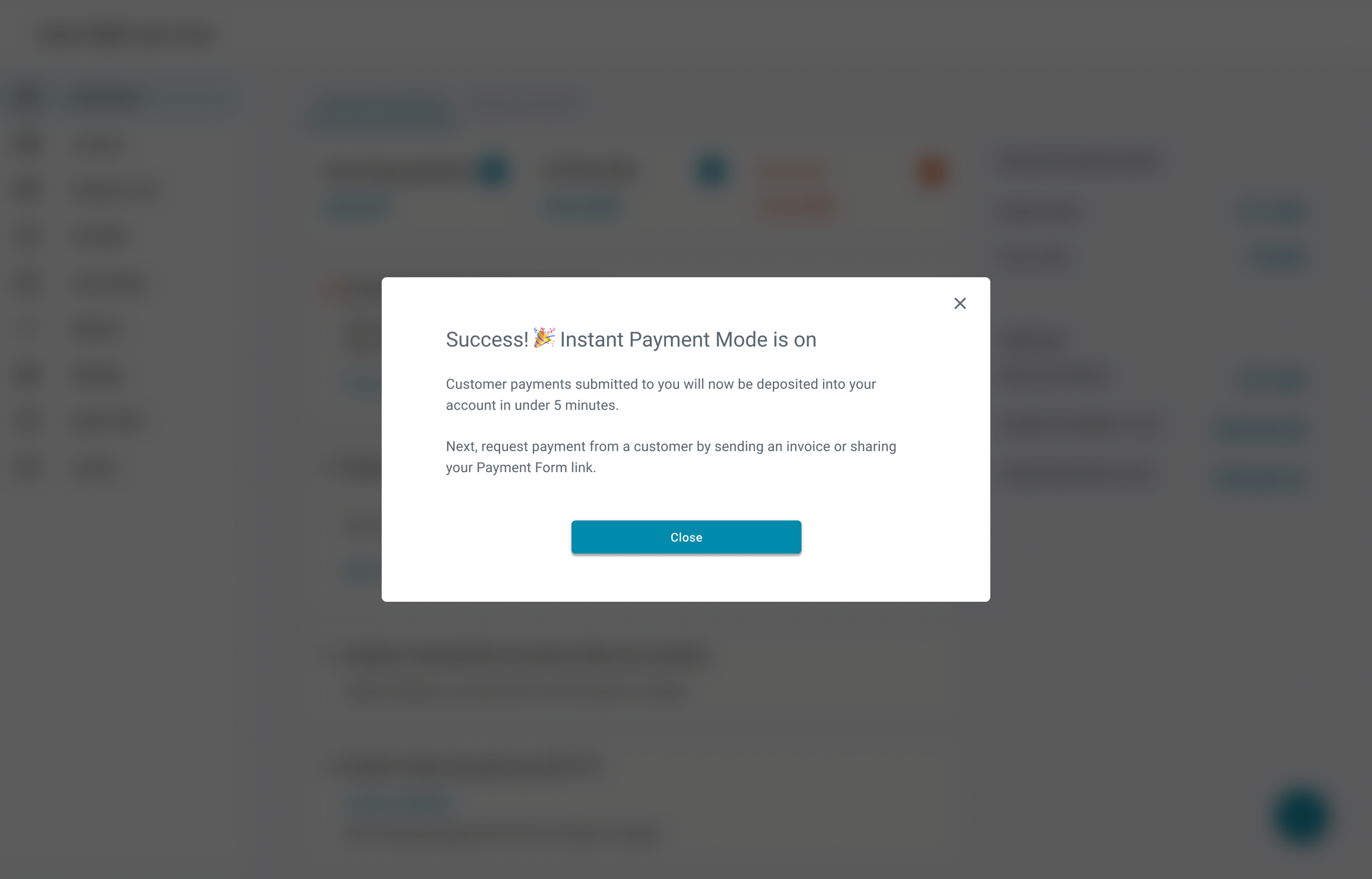
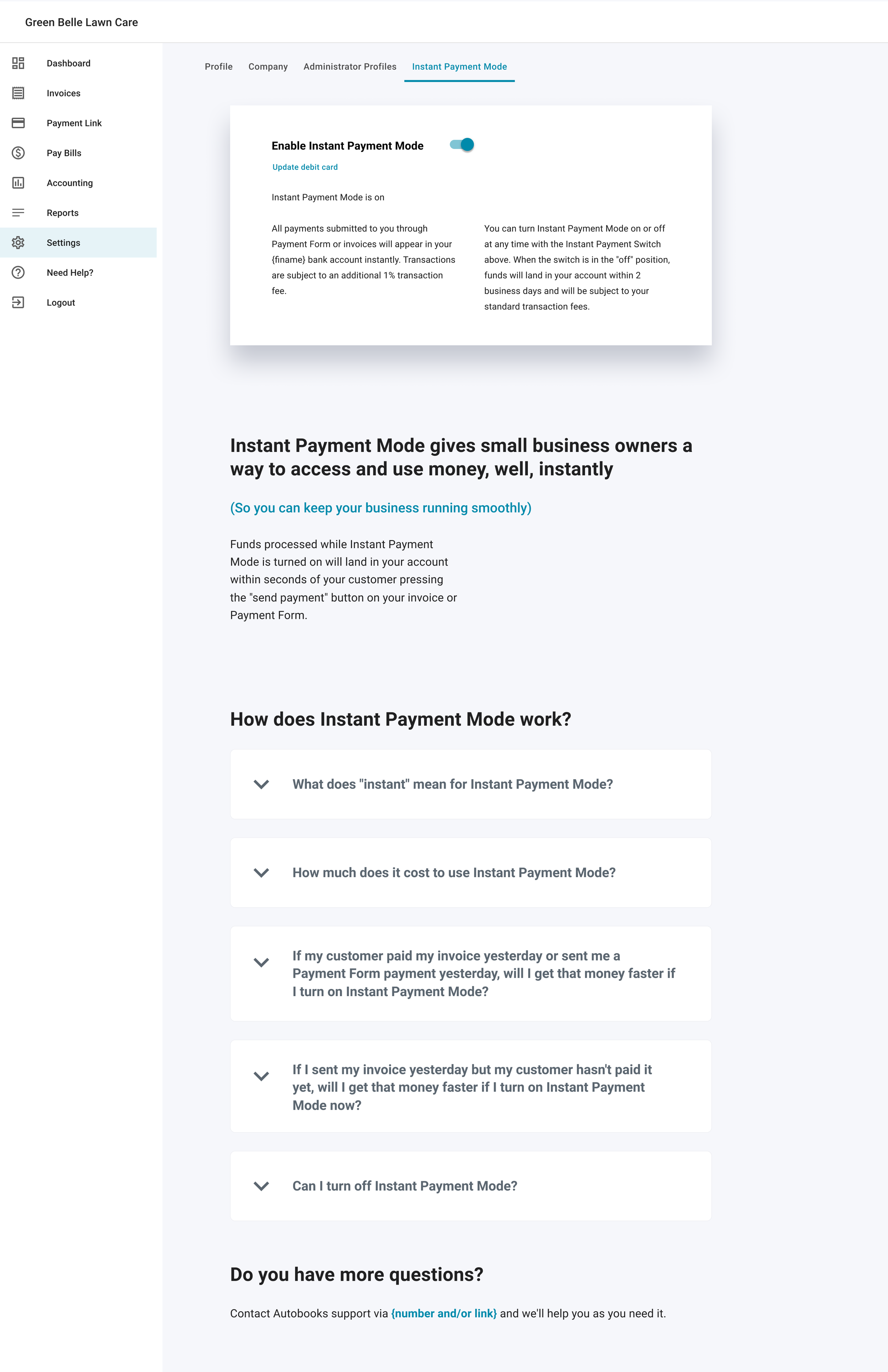
Once IPM is Activated, users will see a success modal appear (regardless of where they currently are in the app). The dedicated IPM page in the Settings section of the app will now have a toggle, allowing users to turn IPM off or back on as they see fit. If users turn the switch off, payments will take the standard multi-day period to settle and the additional 1% transaction fee will not be charged.
Process
Stakeholder Requirements
Users must be notified when they are eligible for our new Instant Payment Mode service
The feature page for Instant Payment Mode will function as a product landing page, with an emphasis on strong conversion copy and compelling imagery
Users can enroll in Instant Payment Mode by providing their debit card information
Users are able to toggle Instant Payment Mode on or off at will once they’ve enrolled in the service
Design Iteration
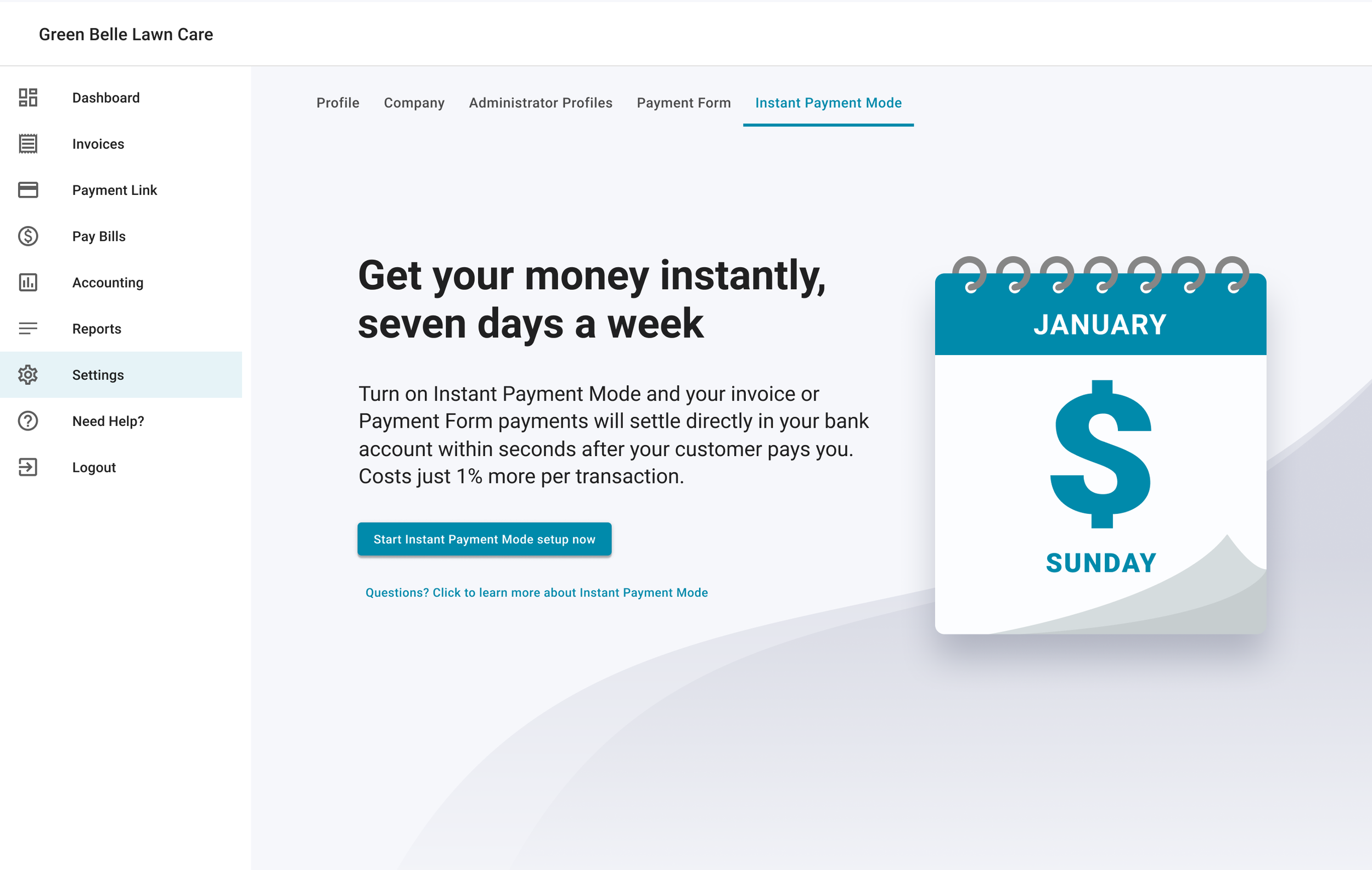
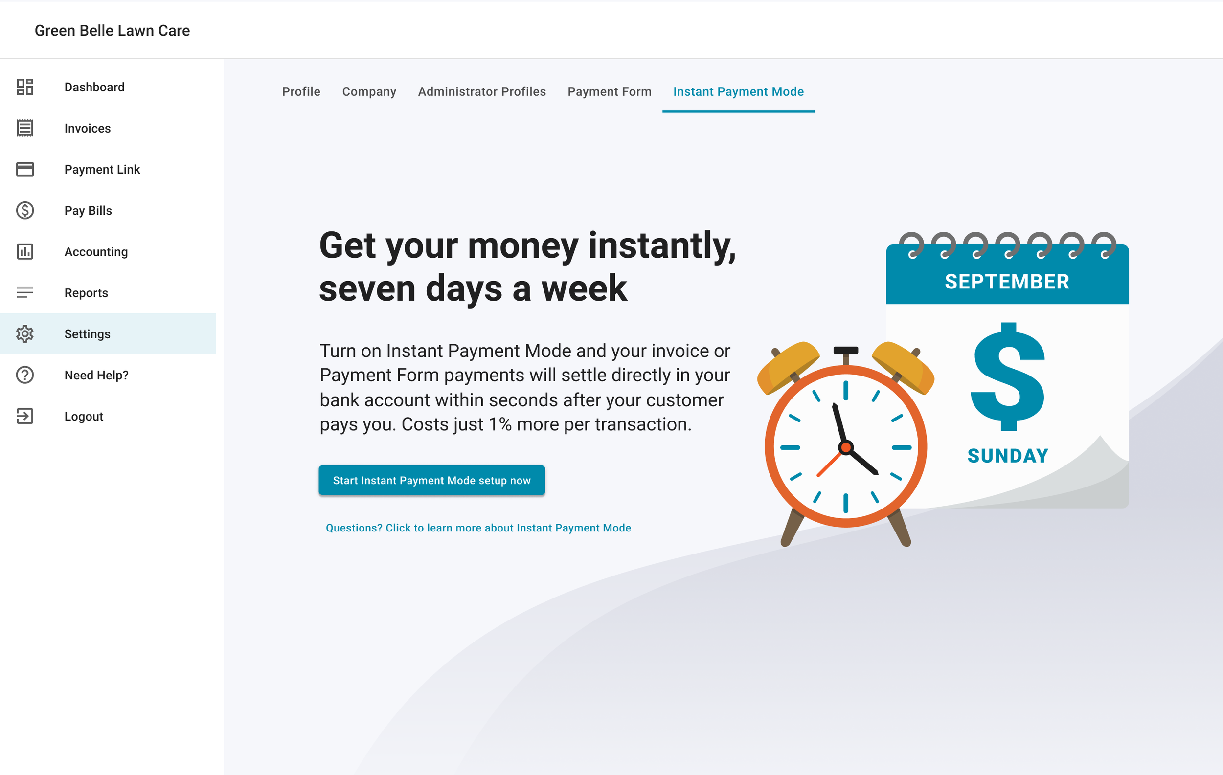
We wanted to focus on getting users to sign up for IPM, so the first thing I focused on for the landing page was the section above the fold. SaaS landing pages aren't exactly a design secret, so I based mine on pretty conventional patterns. Bold header, snappy subhead copy, a conspicuous CTA, and an eye-catching vector illustration that helped give context for the feature. The general layout was quick to design, but we went through several iterations for the vector illustration. I riffed on the themes of “time” and “money” until stakeholders were happy with the final product.
Once we felt good about the section above the fold, it was time to figure out how to organize and display all the copy our conversion copywriter came up with. Our copywriter favored long-form content, so there was a lot of copy to organize. I used type variations, color, weight, and elevation (via card elements) in order to break up each section and keep things visually appealing. For the FAQ’s section, I went with accordion card elements so users could focus on their specific questions rather than scanning even more text to find the info they needed. I ended the page with another CTA card so that users who scrolled to the bottom of the page could sign up without having to scroll back up.
Lessons Learned
This was a great exercise in practicing my skills with landing page design. I learned a lot about layout, type hierarchy, and vector illustration. If I was able to do the project again, I’d prioritize pushing the Product team to finalize content before getting too deep into the layout design of the page. There were many adjustments made late in the project cycle, and given the amount of content in the page combined with multiple states for the feature, the Dev and QA teams had less time to test functionality because they were tracking frivolous content updates.