Design Problem Hypothesis
After spending the first half of 2022 working on boosting our enrollment and enablement metrics, our team shifted its focus to improving our activation metric. We had thousands of SMBs signing up for Autobooks and getting approved to process payments each month, but we needed to make sure all those users were getting paid.
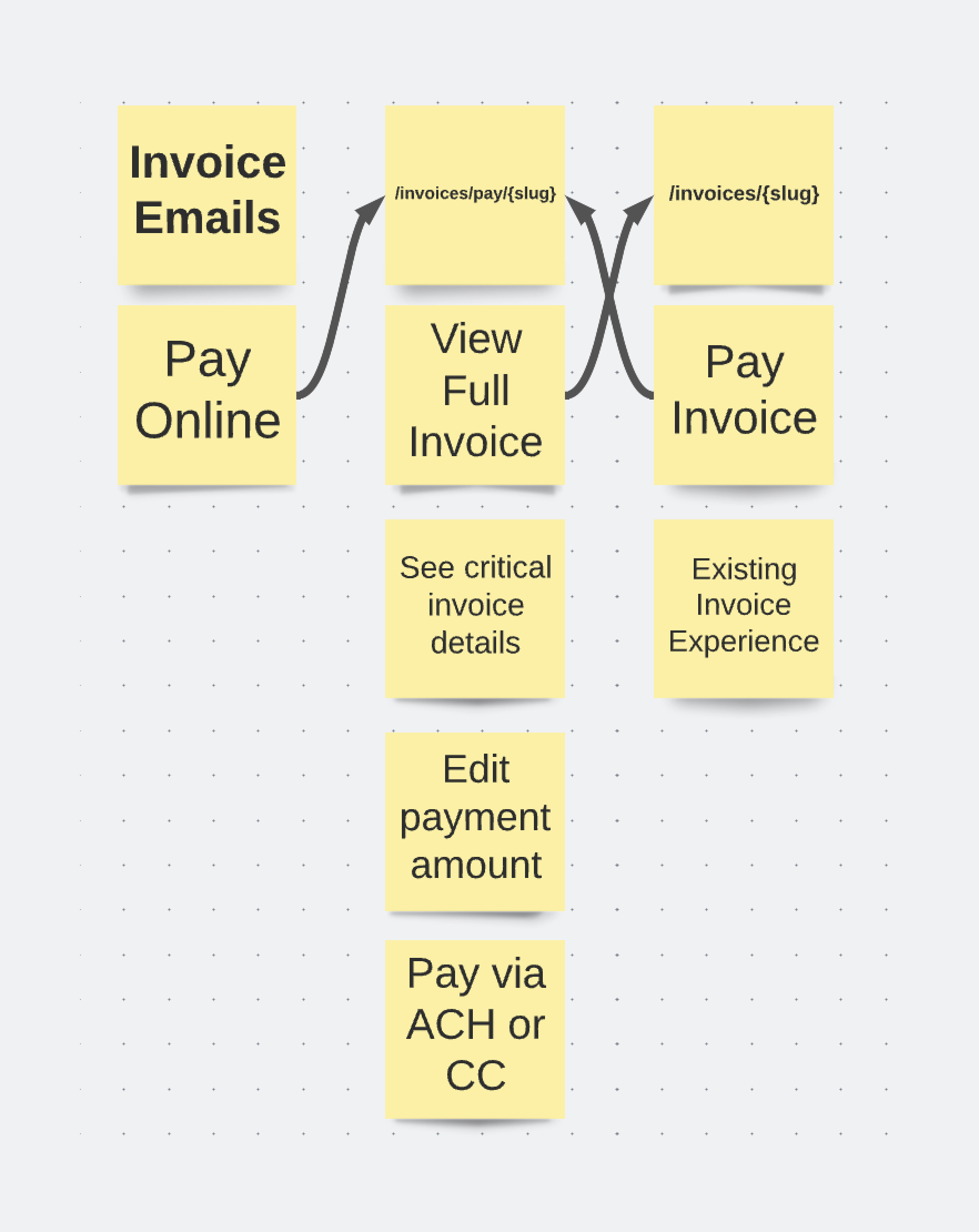
We hadn’t touched the invoice payment experience in over 3 years, and it was optimized for viewing an invoice on desktop, but not for paying an invoice anywhere. In the old version of the flow, users had to click four separate CTA’s in order to submit a payment on an invoice.
First, users would receive an invoice by email and by prompted to view and pay the invoice. Then, users landed on a full view of the invoice and have to hunt for the “Pay online” button. On step three, users entered their full payment information, then clicked “Pay now,” only to land on a fourth step requiring them to confirm and authorize their payment.
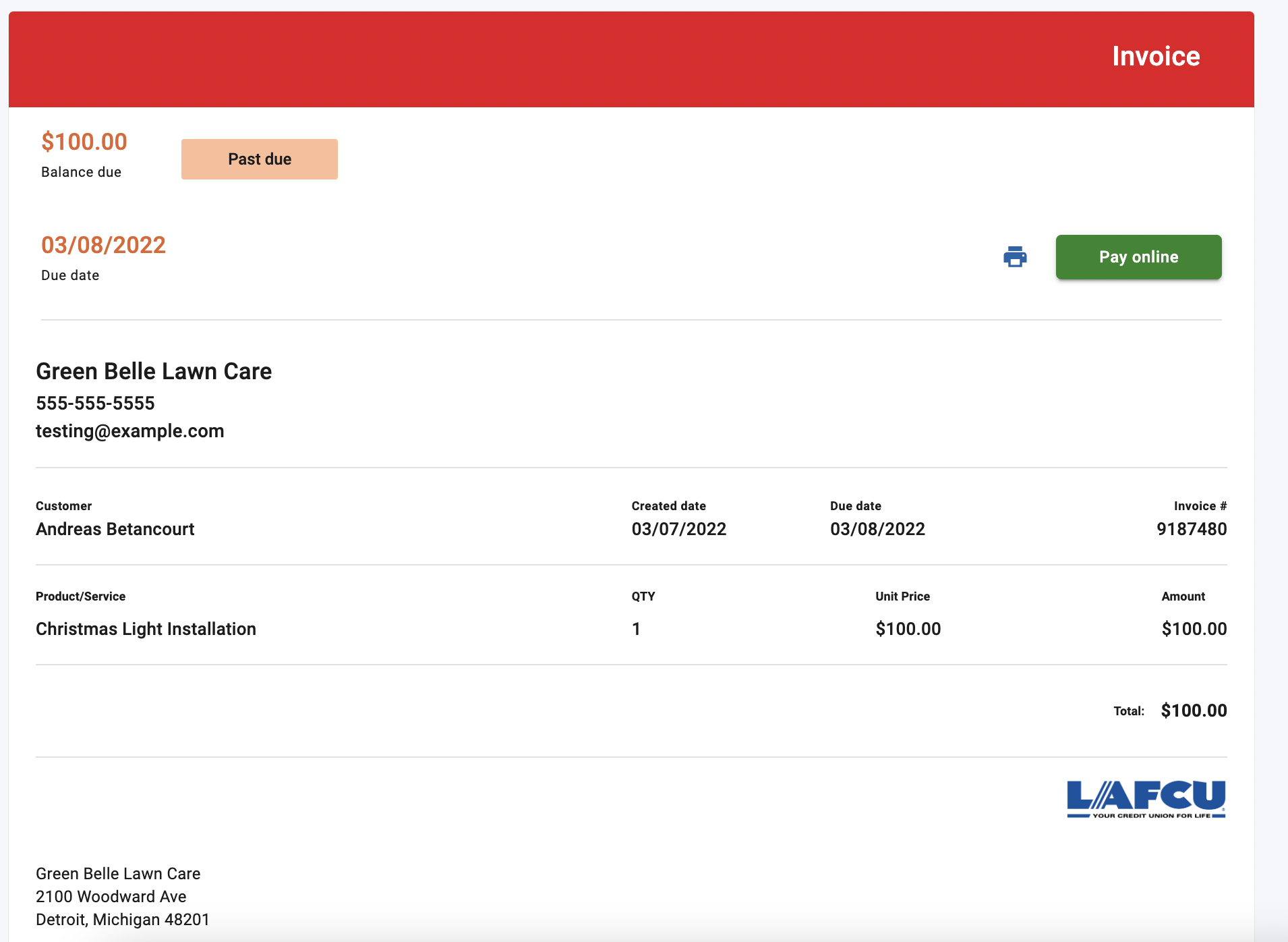
Not only was this design out of step with our business objectives, but it made it harder for customers to actually pay invoices sent by our users. Our Product team found that in August 2022, of roughly 13,000 invoices opened, only 27% went on to be paid by customers.
“Of roughly 13,000 invoices opened, only 27% went on to be paid by customers”
We believed that eliminating friction for customers in the form of unnecessary steps taken to complete a critical action would result in increased activation by increasing the conversion rate of paid invoices. By streamlining our invoice payment experience, we believed we could increase the percentage of paid invoices in order to bolster our activation numbers.
Role
I was the sole Product Designer on this project. The other team members I worked alongside were:
CPO, SVP Product, Product Managers
Conversion Copywriter
Engineering Team
QA Team
Impact
This feature update had a huge impact for our users. Perhaps most significantly, we cut the number of steps required to engage with a core product experience in half, and increased conversion to 67%. We also reduced cognitive load on the page by making it look and function like a form rather than shoehorning UI into an invoice document. Finally, we made mobile a first-class citizen by optimizing for users on phones / tablets before scaling up to desktop.
“We cut the number of steps required to engage with a core product experience in half, and increased conversion to 67%”
Solution
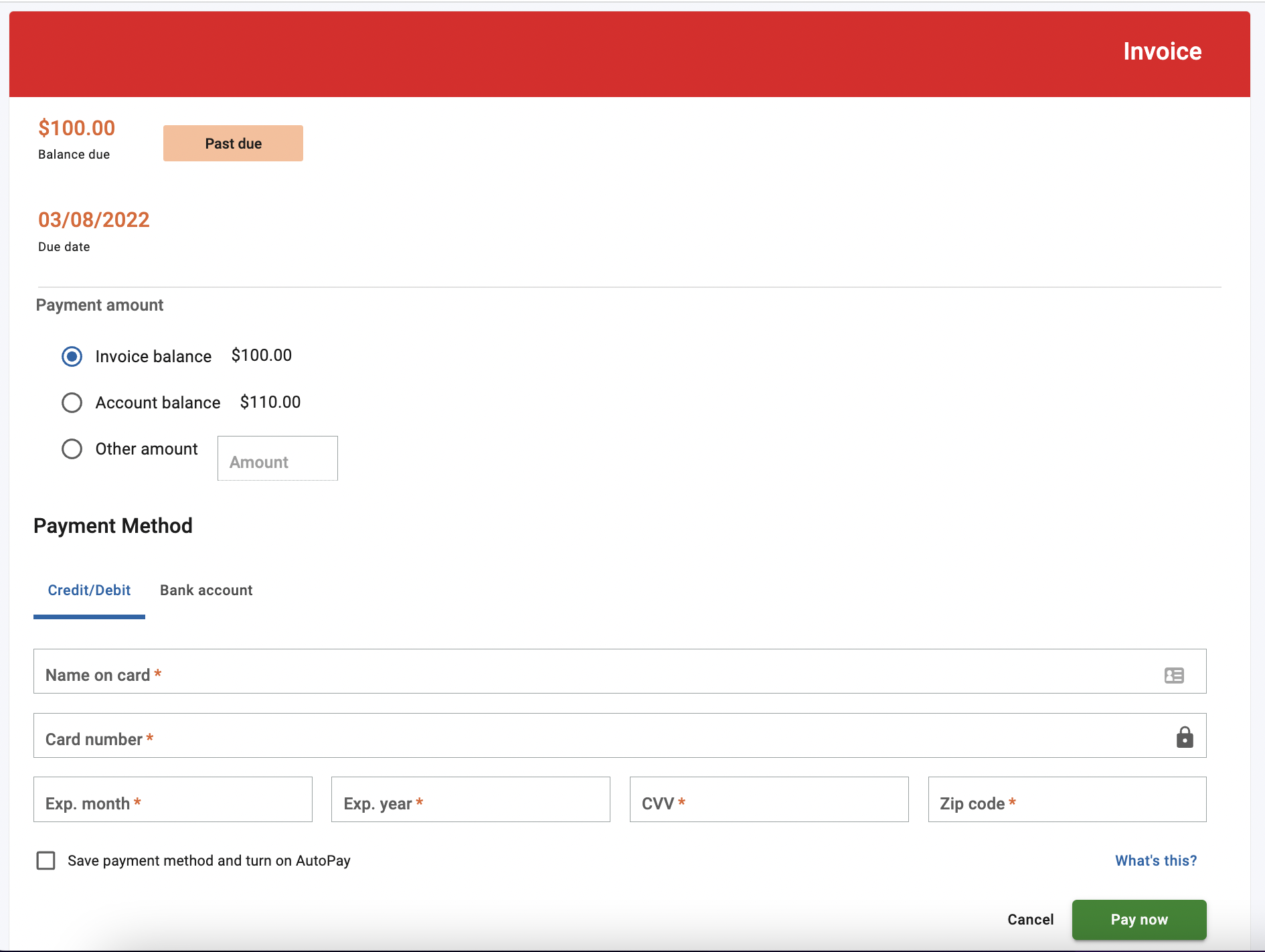
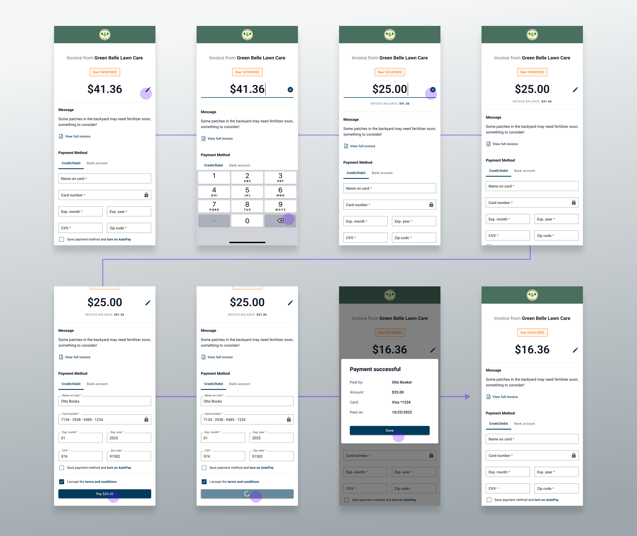
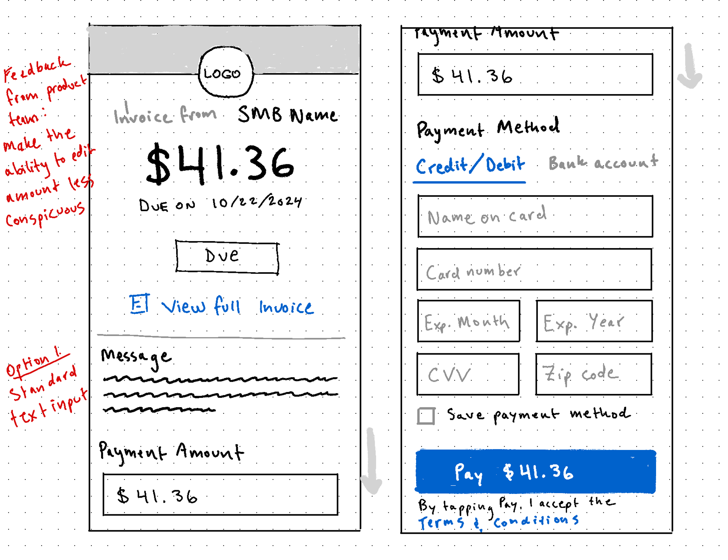
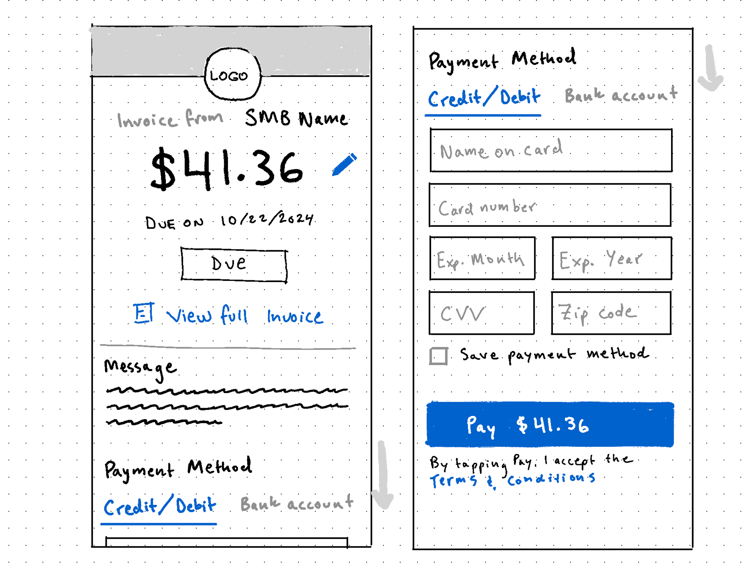
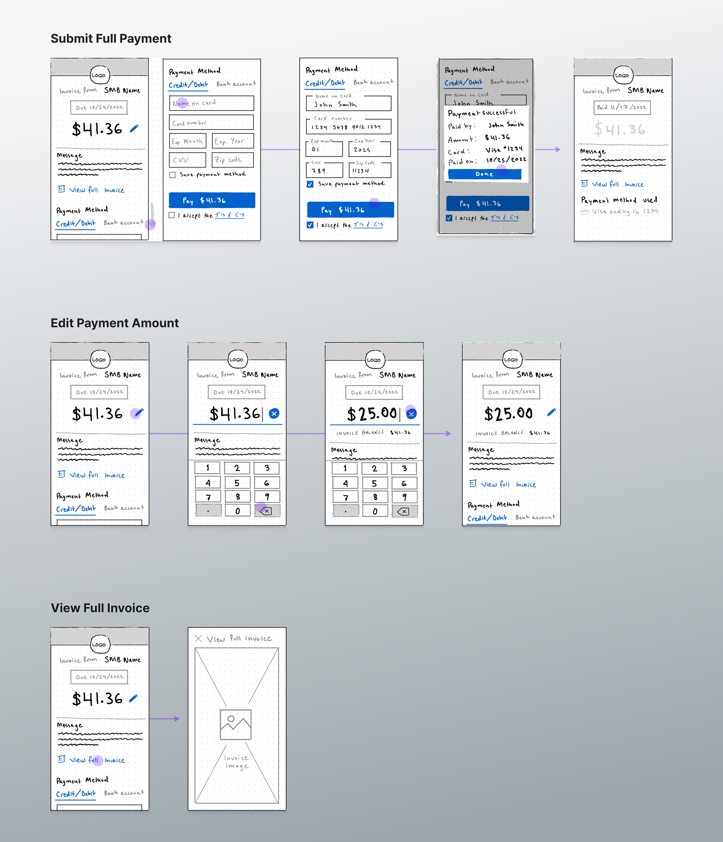
To solve this problem we created a new invoice payment experience that prioritized paying the invoice while still allowing users to view the intricate details of their invoice via a secondary affordance. Our main priority was to consolidate the previous multistep flow into a single page experience, and to use clear form patterns with an affordance for a dedicated invoice view. We also wanted a mobile-first design, as more of our users were shifting to mobile usage at the time.
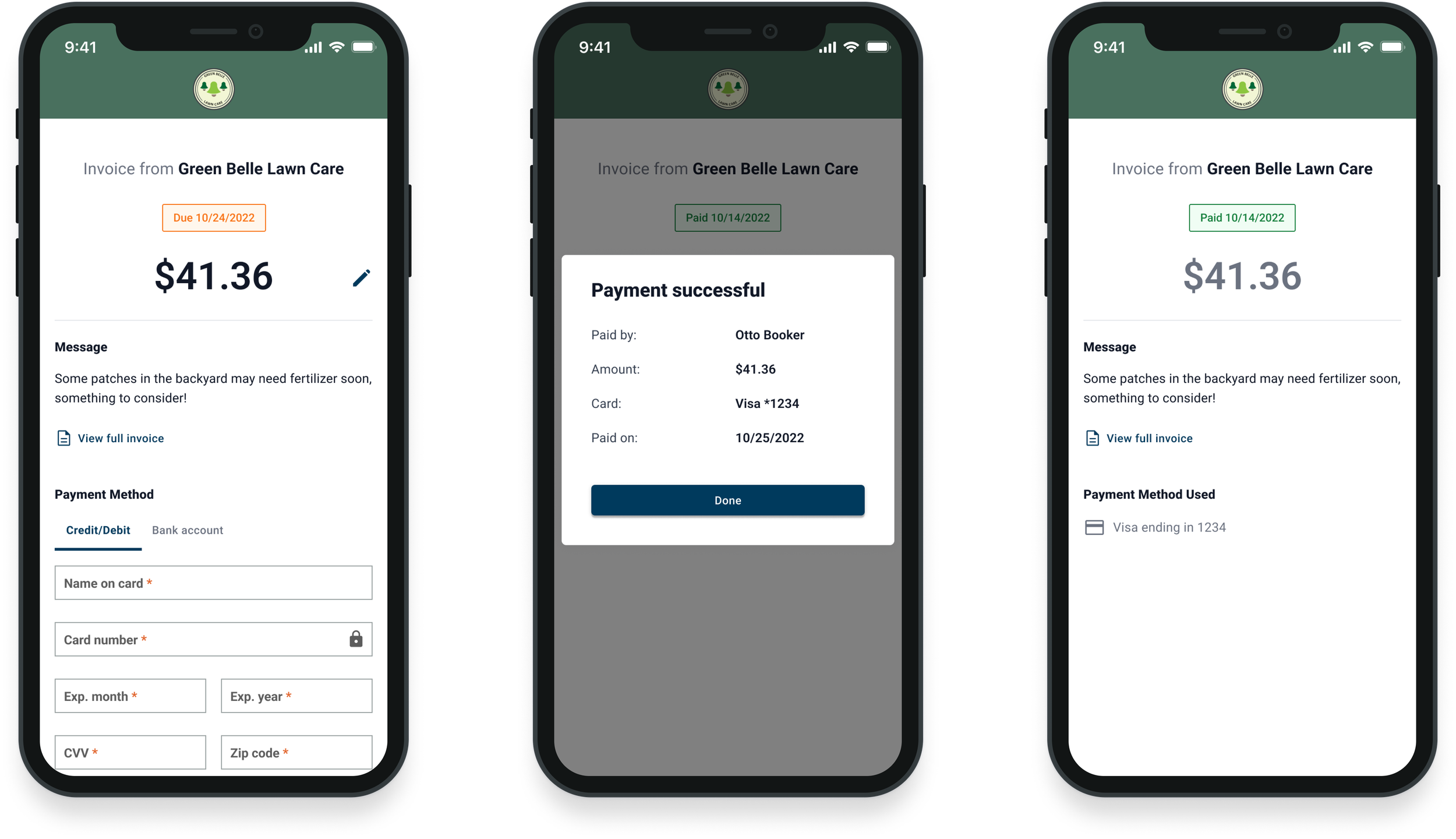
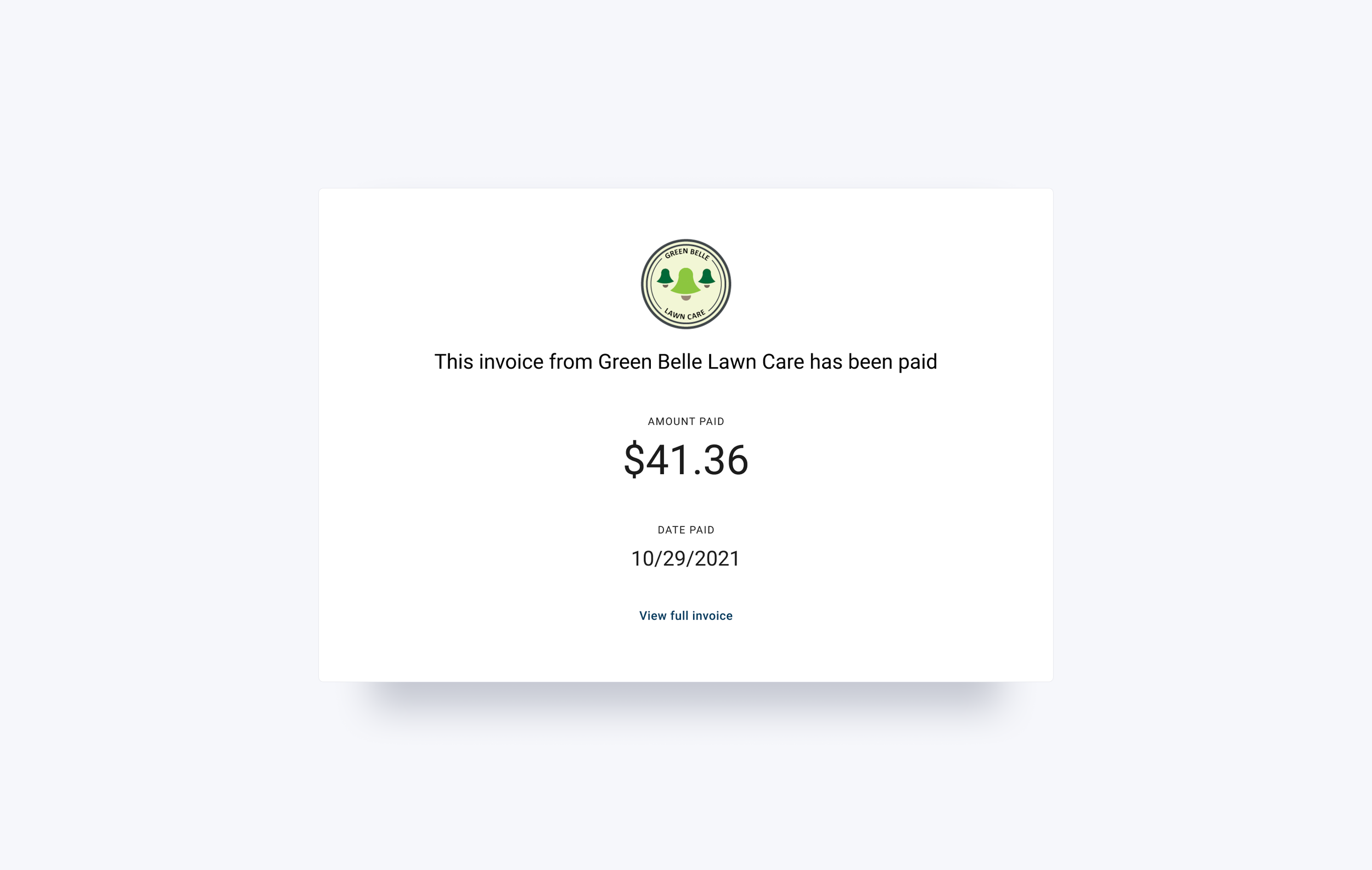
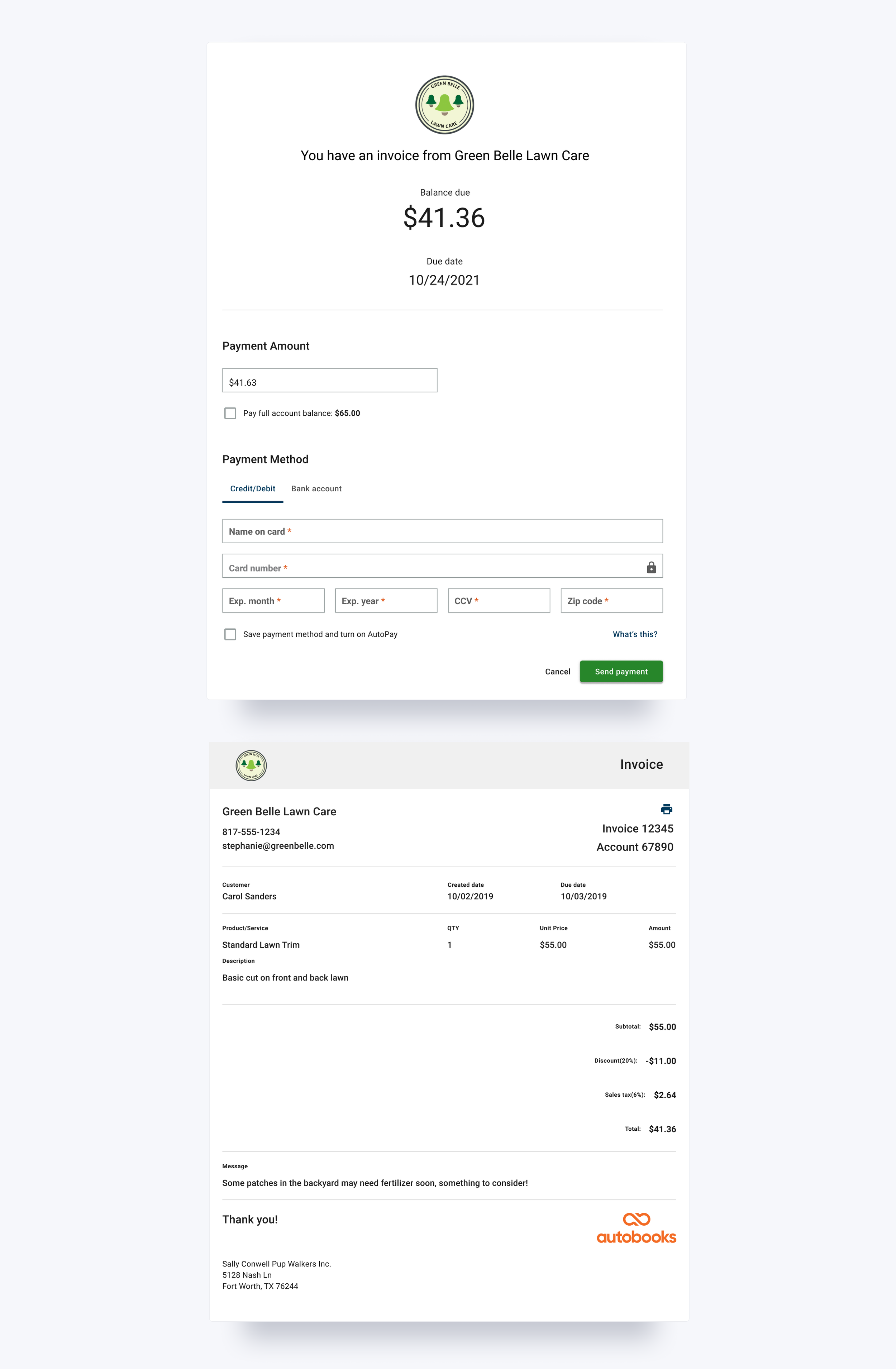
In our final solution the invoice amount was displayed prominently at the top of the screen with an affordance to edit the payment amount, along with the status of the invoice. We kept the theming and logo configured by the small business owner so that users would feel more confident that the form was tied to the business they were trying to pay. We also kept the optional invoice memo from the SMB in order to remind the user what they were actually paying for without needing to view the full invoice.
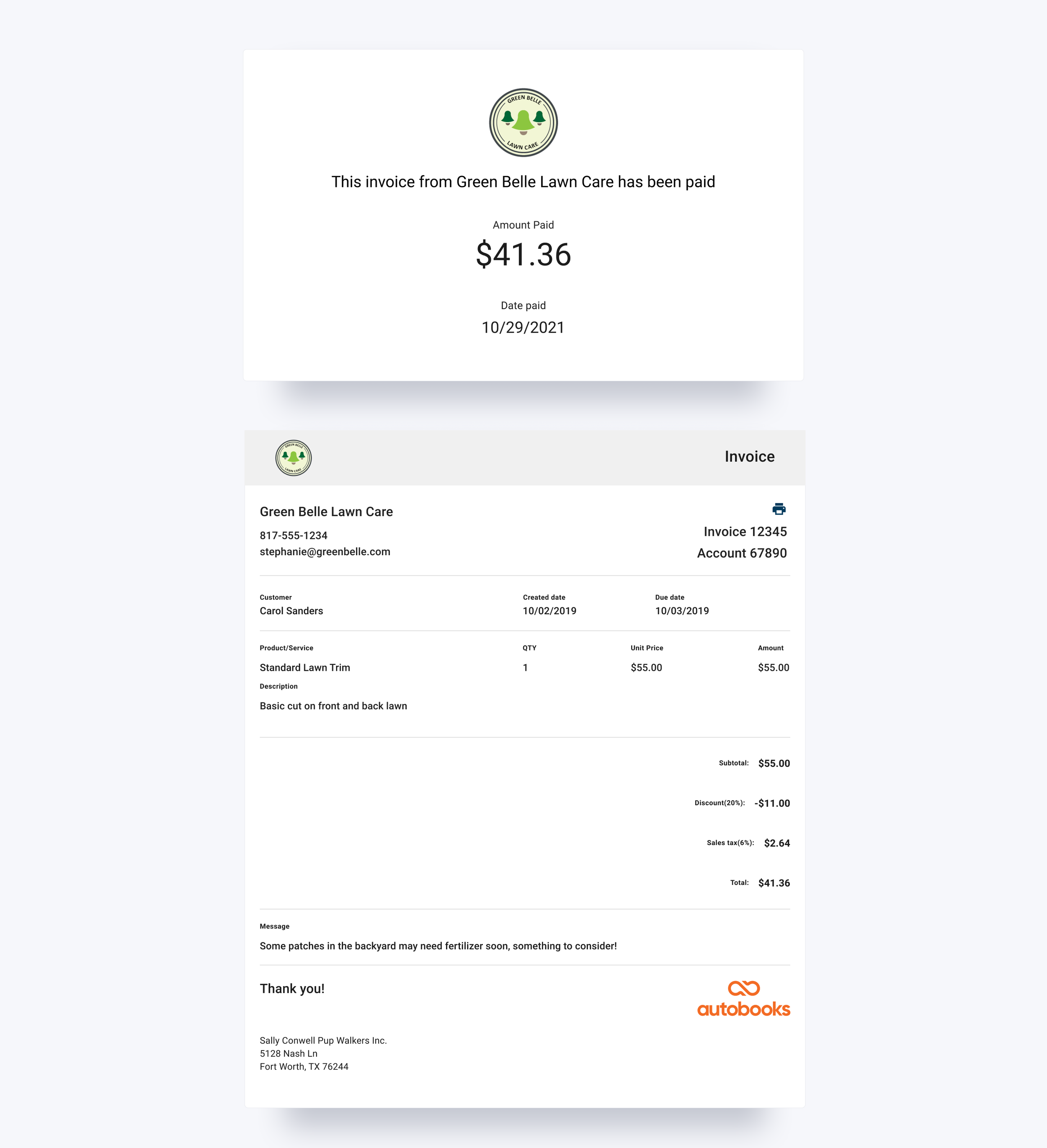
However, if they wanted to view the invoice itself, we included an affordance to pull up a downloadable PDF of the full invoice in a dismissible modal over the payment experience.
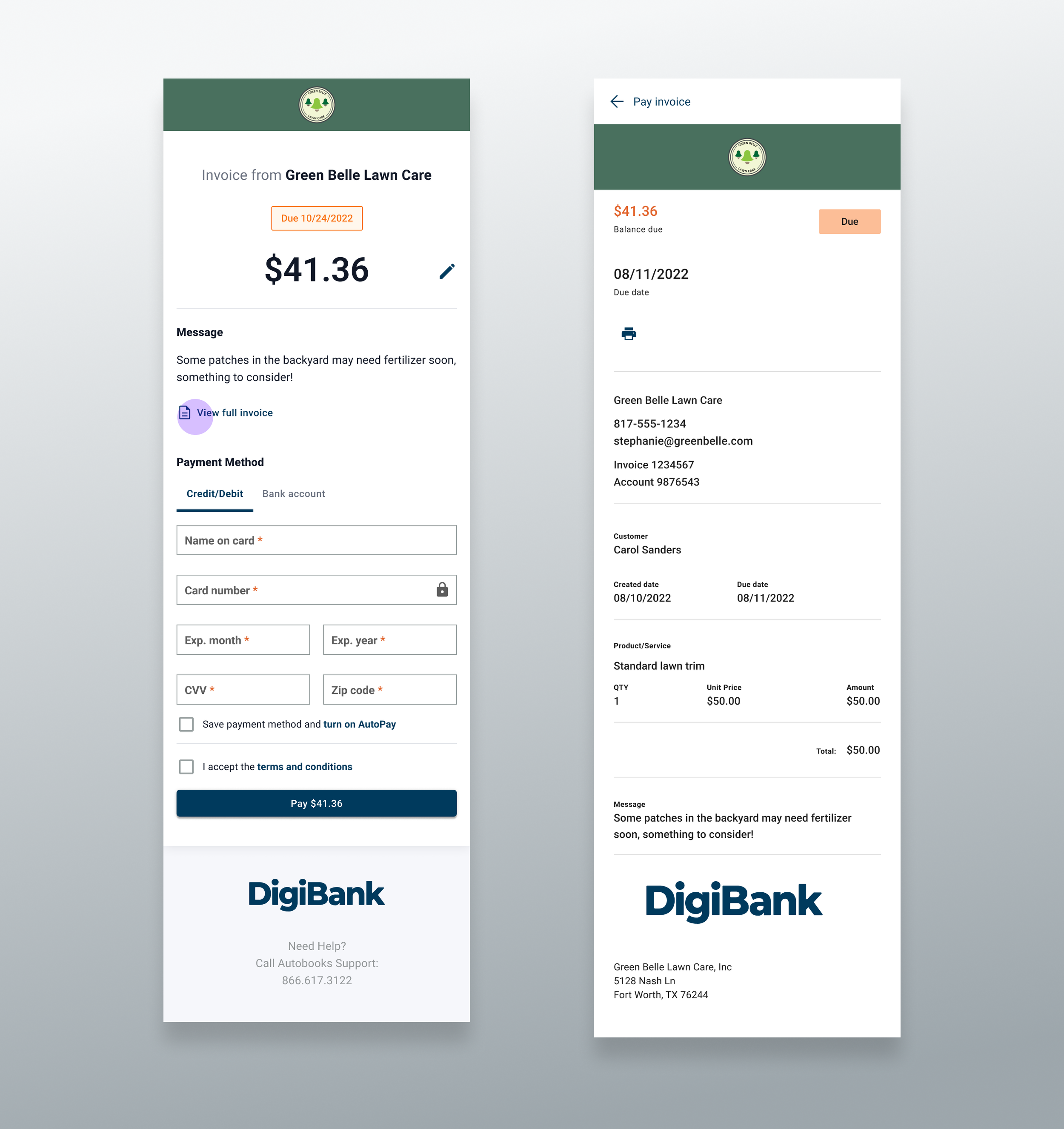
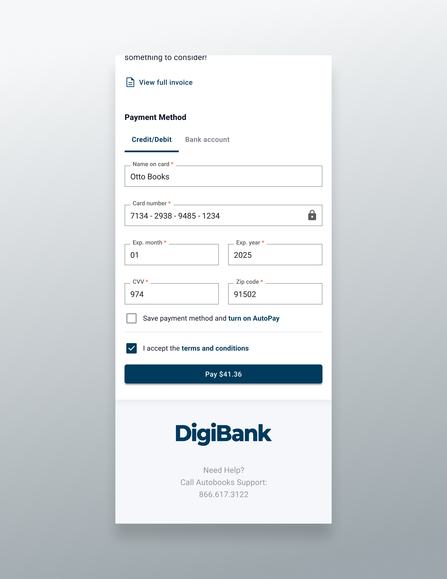
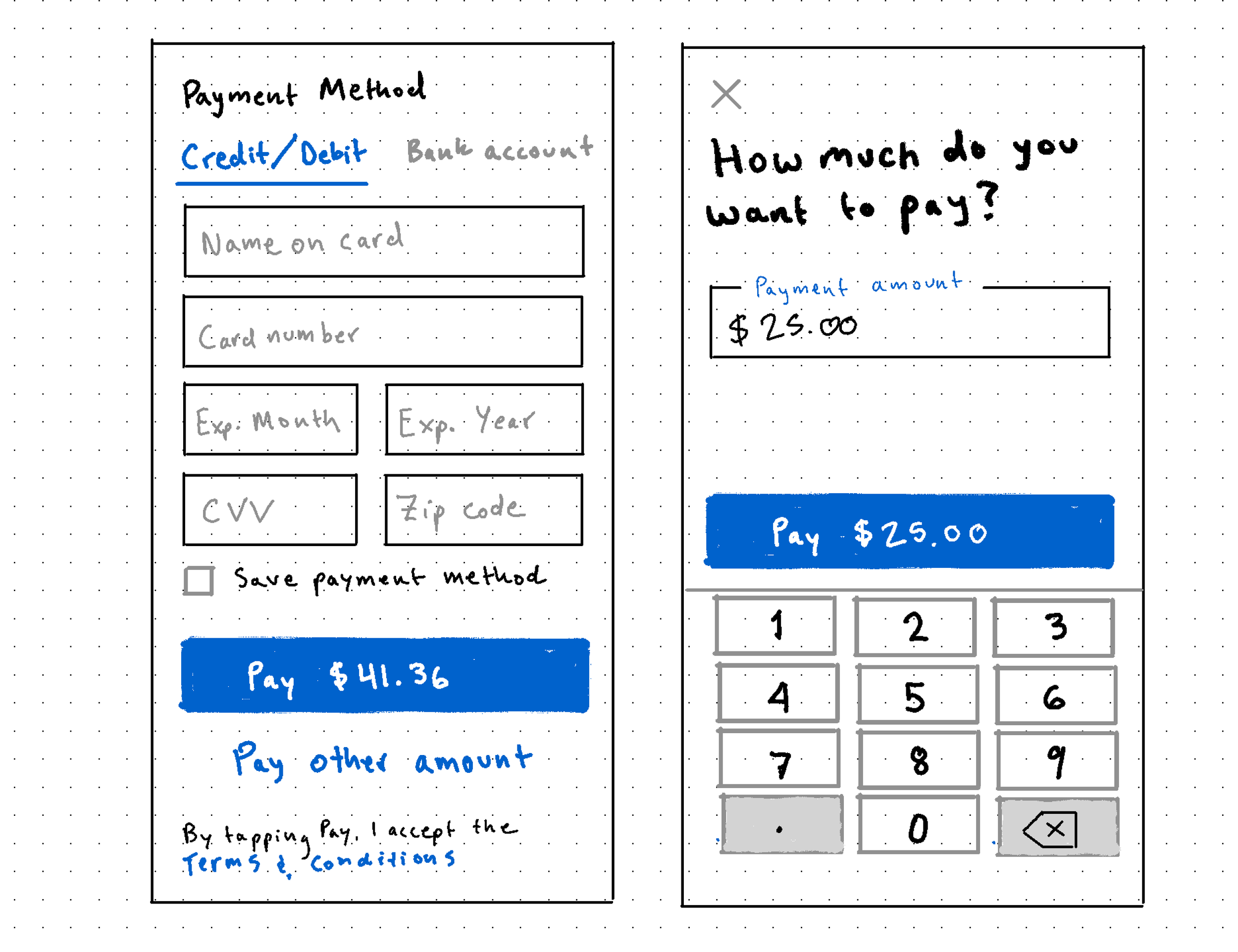
The Payment Method section of the form was fairly standard, with a tab nav allowing users to choose between credit/debit or ACH transfer as their payment method. This section also includes a checkbox affordance to save the entered payment method and turn on AutoPay, which would allow Autobooks to automatically pay any outstanding invoice balances as soon as they became due using the saved method. Next was the required Terms and Conditions agreement affordance, as well as the main Pay CTA. We decided to add the payment amount to the Pay CTA label so that users wouldn’t have to scroll back up to the top of the page to verify how much they’d be paying after entering their payment method details.
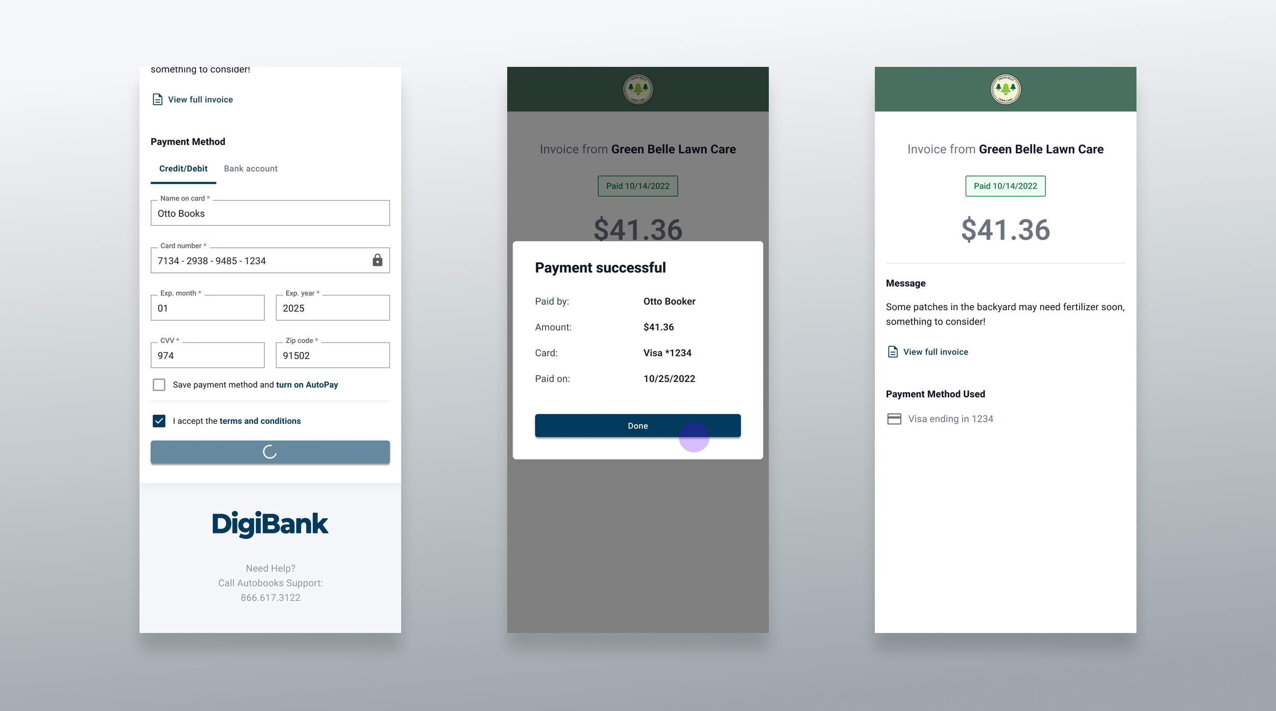
After submitting a successful payment, users would see a success modal with a table summarizing the details of their payment. Assuming the user paid the full invoice amount, after dismissing the modal users would see an updated version of the payment experience screen with a the invoice status changed to Paid, the payment amount text would change from an editable field to a static text element, and all payment method fields would be replaced with a line item summarizing the method used. Users could still view the invoice message, as well as the downloadable full invoice PDF.
If users made a partial payment the view would largely resemble the original payment experience, but the amount due would be updated to reflect the remainder of the invoice balance, and we’d show the original invoice balance as a subhead underneath the outstanding balance amount.
Process
Stakeholder Requirements
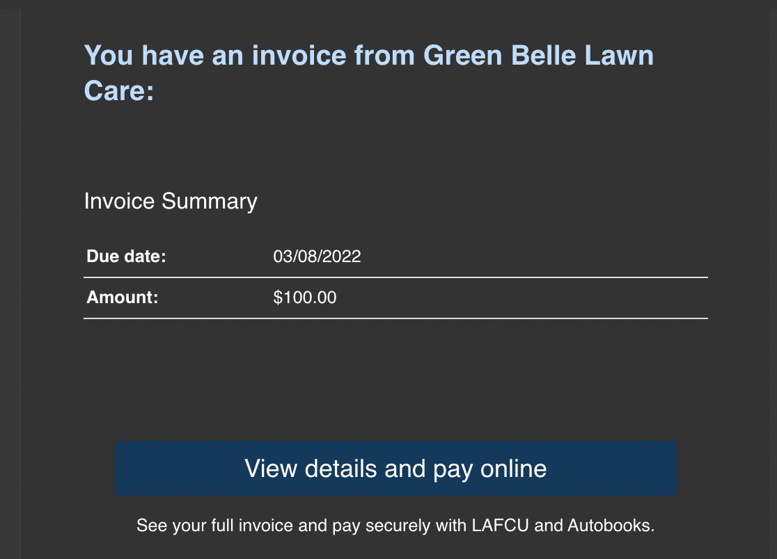
The user can choose to pay an invoice from their email
The user can pay their invoice online
The user can see critical details about the invoice
The user can choose to pay an amount other than the remaining invoice balance
The user can pay their invoice via Credit Card or ACH
Design Iteration
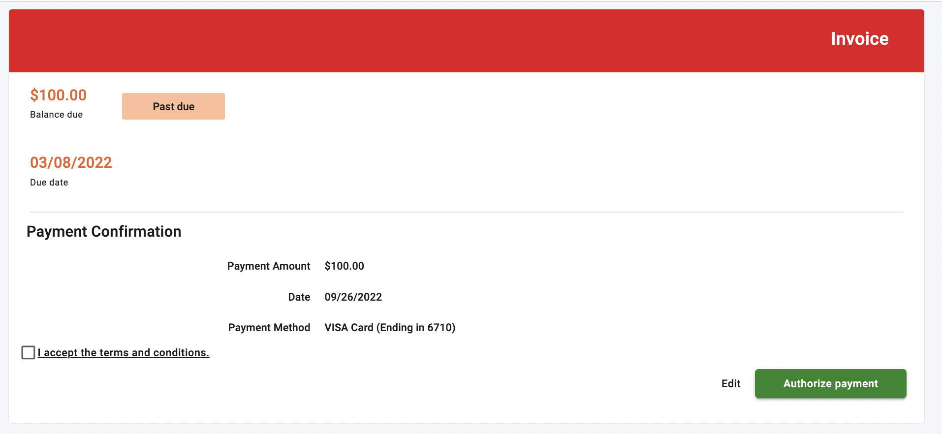
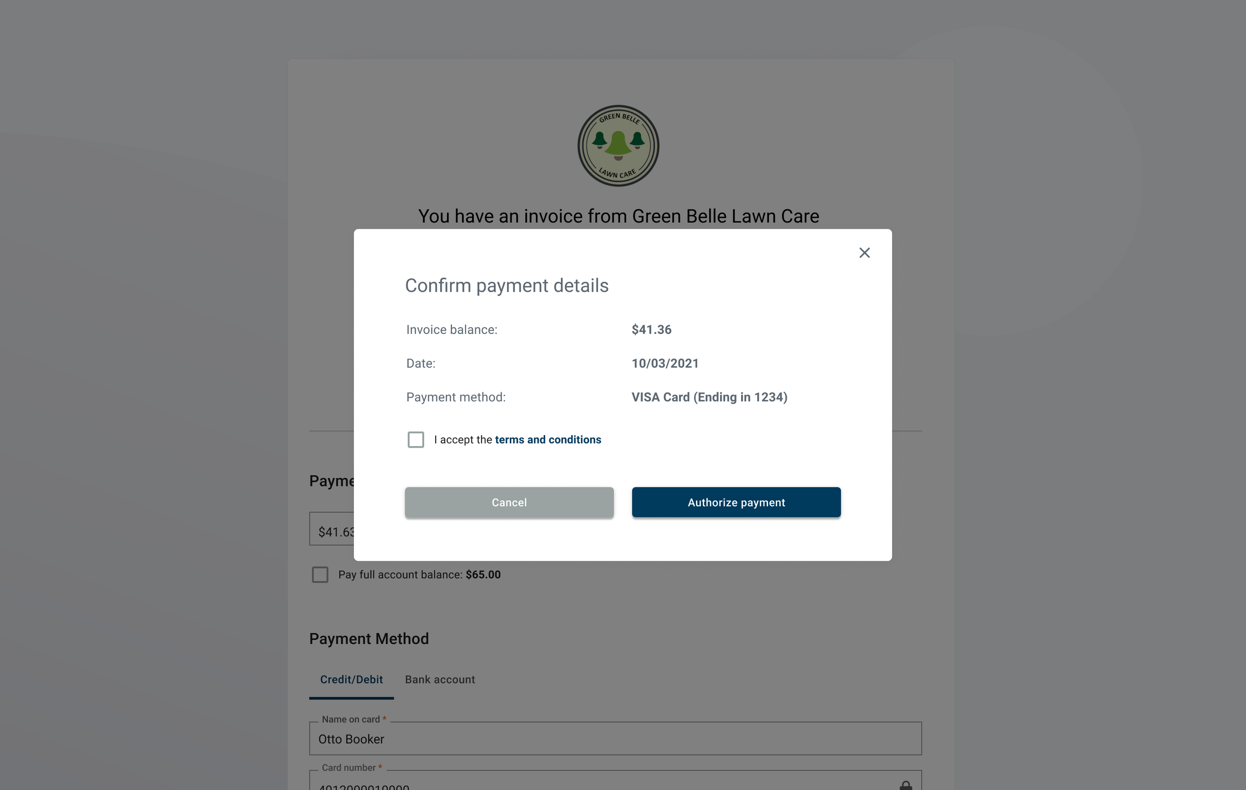
Our first thought was to use our existing anonymous payment link form and to add in the required elements for paying an invoice such as invoice status, due date, and balance due. However, we weren’t sure how we should display the actual invoice in tandem with the form. We weren’t crazy about stacking them vertically on the page, so we opted for showing the invoice as a modal preview. We were also still hanging on to unnecessary steps from the prior flow, such as including a “confirm payment” modal after users hit the initial Pay CTA.
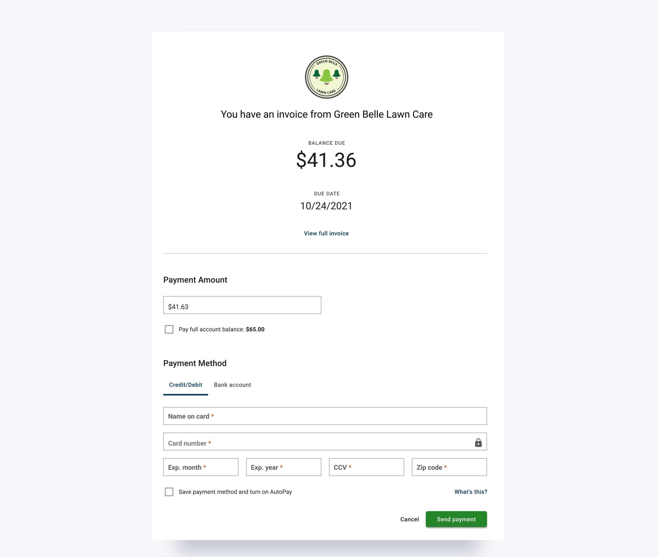

We decided to iterate at lower fidelity and design for mobile first, then scale up to desktop. In our original mobile design, we had the total amount due as a static display element that was separate from the payment amount field.
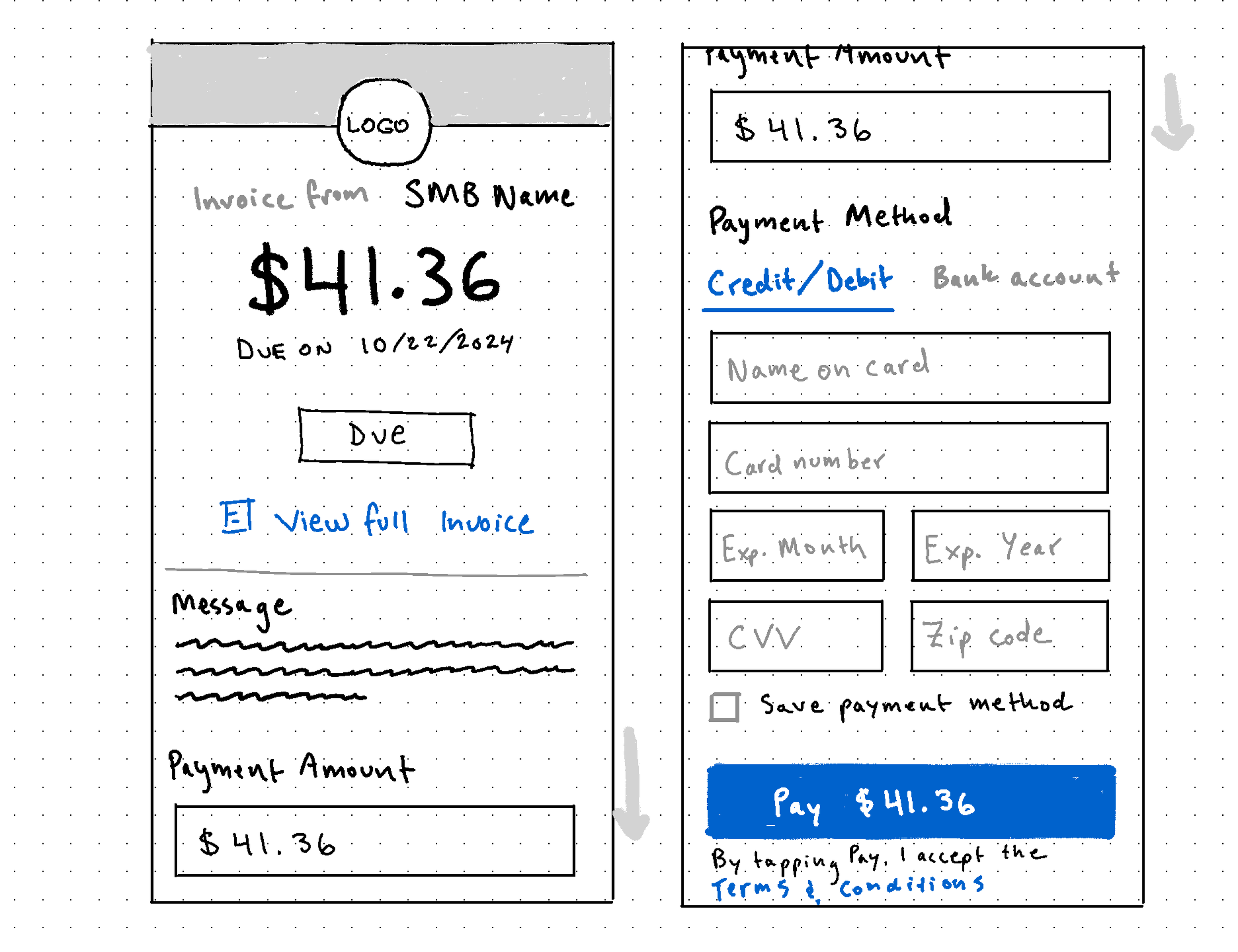
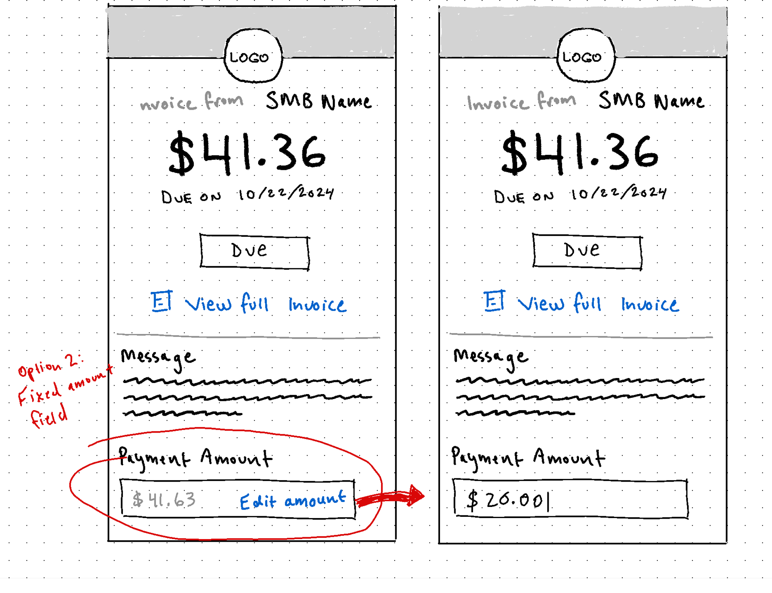
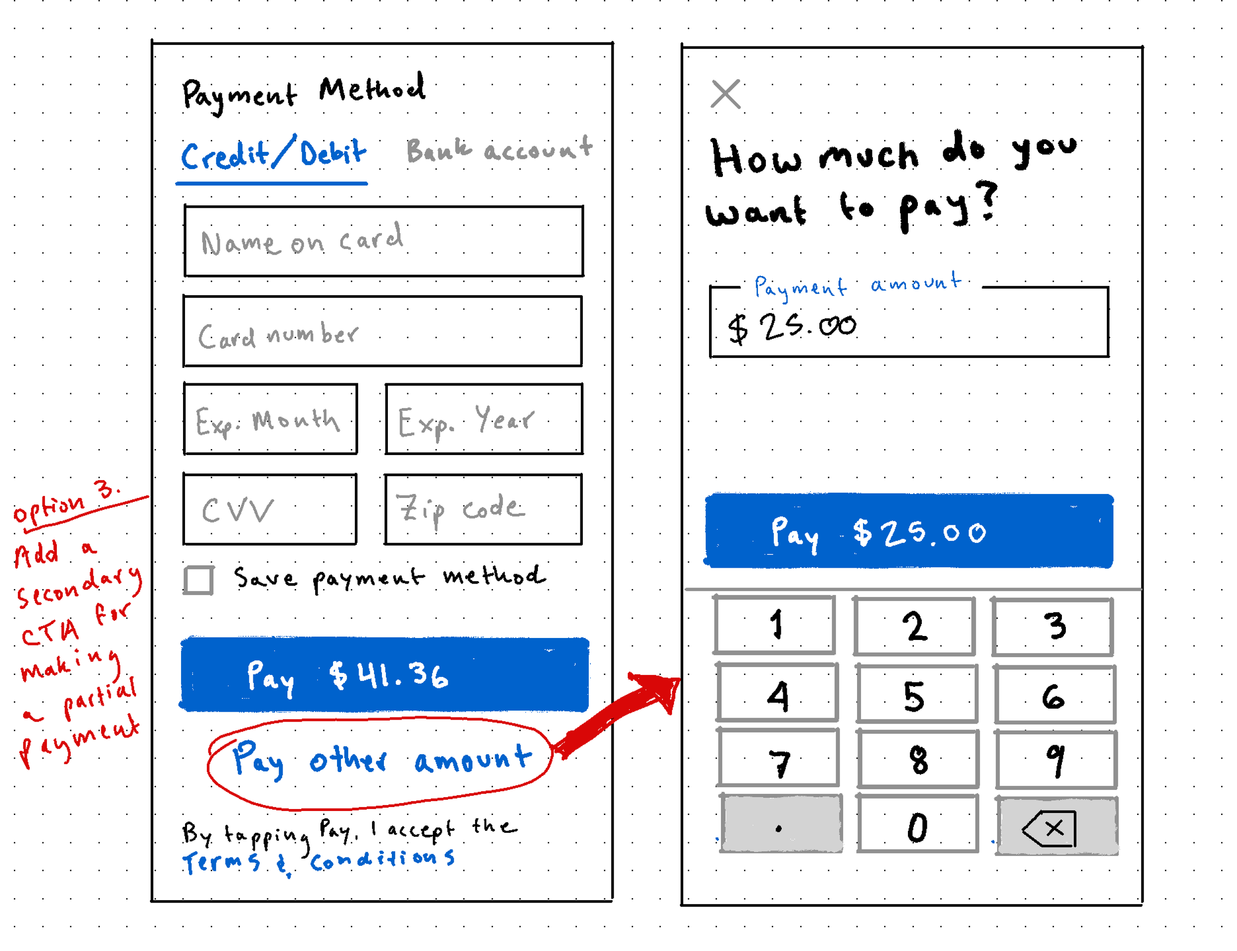
We received feedback from the Product team that they wanted the flow to treat paying full invoice amount as the default user behavior, with partial payments as secondary functionality. To reflect these priorities, I iterated on different ways to make editing the payment amount feel like more of a conscious choice rather than an automatic response. Some options we considered were:
Making the payment amount field a fixed input until users tapped an “Edit” affordance
Add a secondary CTA for making a partial payment underneath the primary CTA at the bottom of the form
Add an edit affordance next to the invoice amount header at the top of the page that would let users turn the static text element into a text input field.
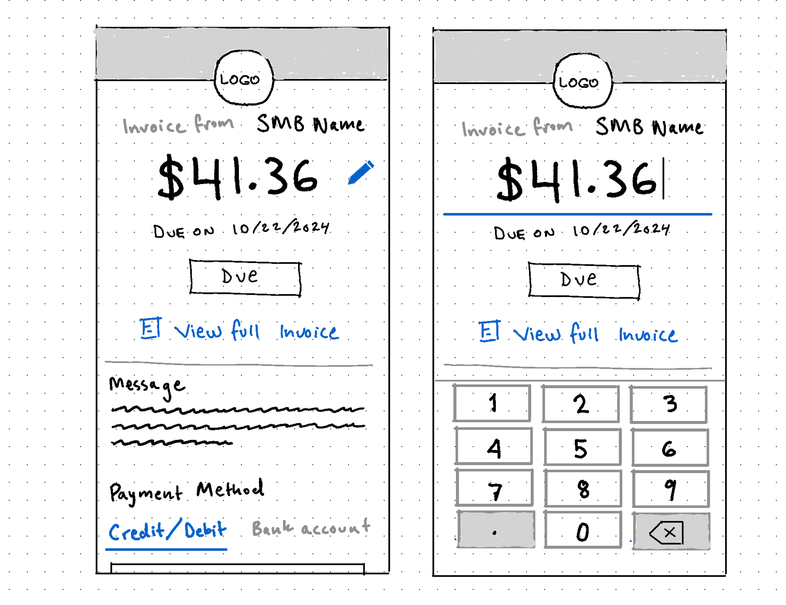
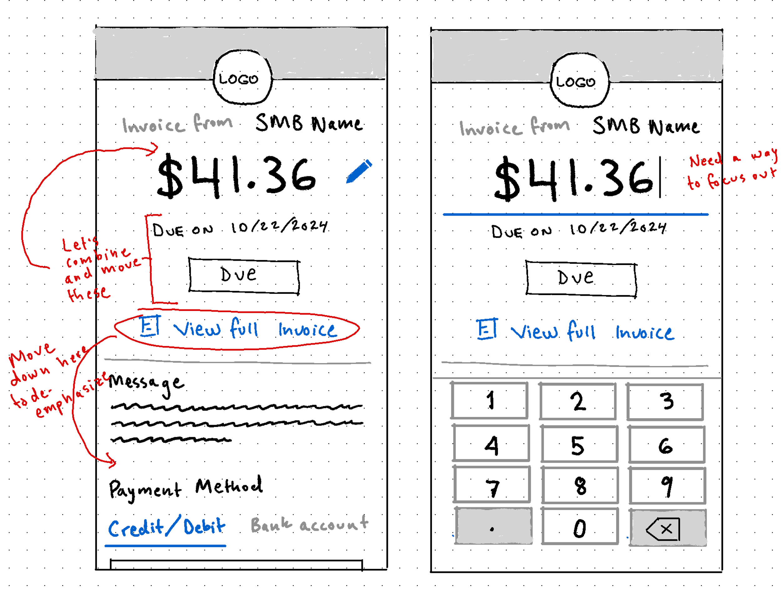
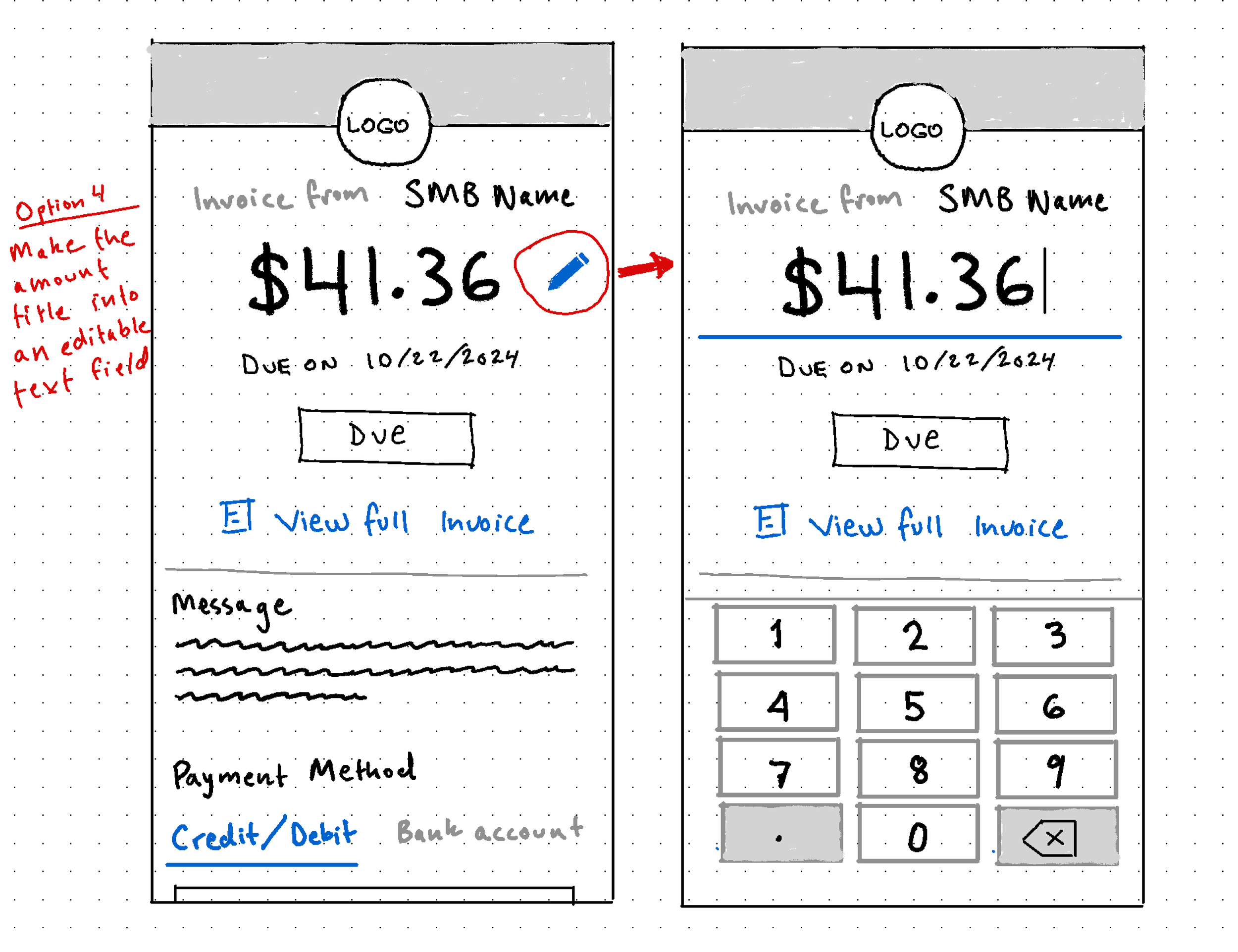
We landed on the third option because it reduced the amount of vertical scroll on the page, consolidated the invoice amount and payment amount elements, and prioritized one of the primary actions on the page. Once we understood how we wanted the amount field to function we were able to mock up the rest of the flows, including:
The transition to high fidelity designs was pretty straightforward using our Material-UI component library as a guide. For desktop, we used the legibility principle of 60-75 characters per line on an 8px grid to determine the main column width on the page, then built the rest of the content around that.
Lessons Learned
This project taught me the value of iterating at low fidelity to explore lots of solutions before investing time and energy into high fidelity mocks or development, the power of questioning whether each step of a prior solution is actually necessary, and how to optimize user experience through simplicity and reduction of cognitive load. If I could do the project over again, I’d probably advocate for user testing during the iteration stage to help us identify gaps in the solutions we liked to check our assumptions about what made for the best experience.